Demand Curve
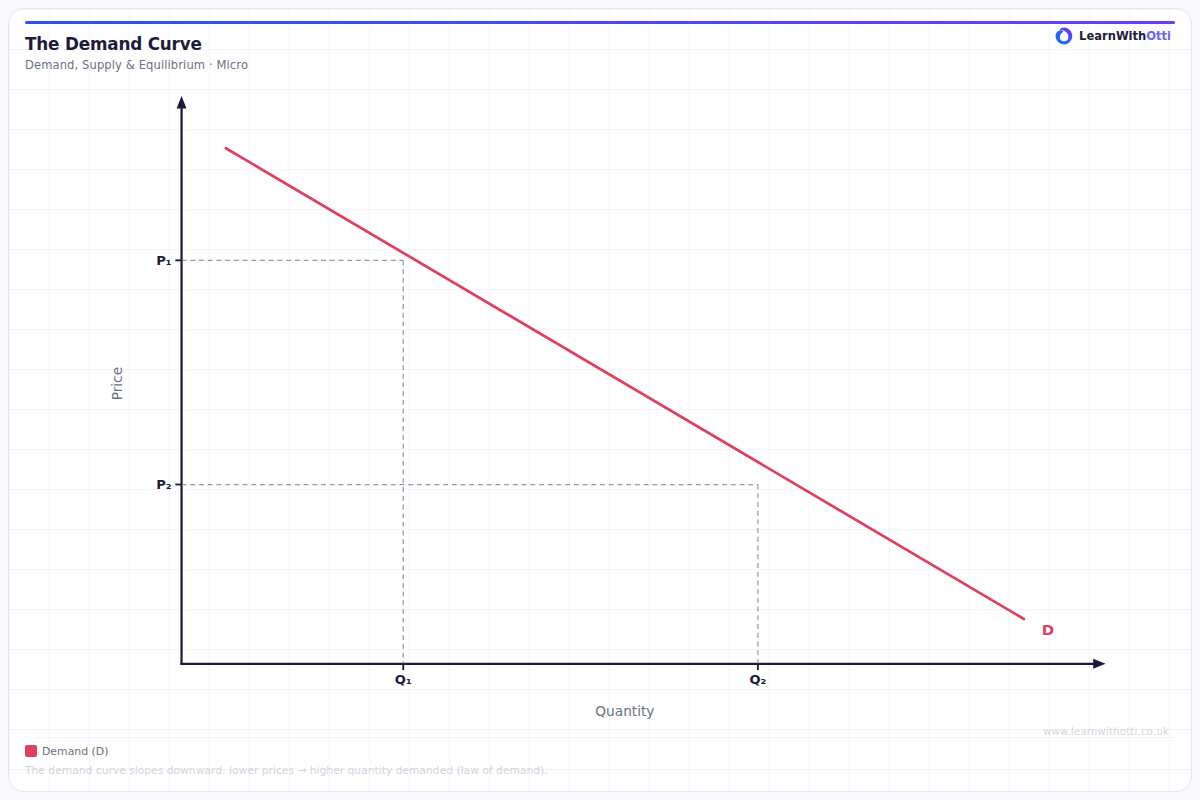
The downward-sloping demand curve showing the inverse relationship between price and quantity demanded. Illustrates the law of demand with a standard D curve.
Printable preview
Download a static PNG of this diagram to print or include in revision notes.
Download PNGWhat this diagram shows
The demand curve shows the relationship between the price of a good and the quantity consumers are willing and able to buy at each price level, ceteris paribus (all other things being equal). It slopes downward from left to right because of the law of demand - as price falls, quantity demanded increases, and vice versa. This inverse relationship exists due to the income and substitution effects. Understanding demand curves is fundamental to analyzing market equilibrium and predicting how markets respond to changes.
Key points
- The demand curve slopes downward due to the law of demand - there's an inverse relationship between price and quantity demanded
- A movement along the curve occurs when price changes, while a shift of the entire curve happens when non-price factors change (income, tastes, substitute prices, etc.)
- The curve shows the maximum price consumers will pay for each quantity, or alternatively, the maximum quantity demanded at each price
- Individual demand curves can be added horizontally to create market demand curves
- The position and slope of the curve depends on factors like income levels, consumer preferences, and price elasticity of demand
Exam tip
Always label your axes correctly - Price (£) on the Y-axis and Quantity on the X-axis. Examiners are impressed when students can distinguish between movements ALONG the curve (due to price changes) versus shifts OF the entire curve (due to non-price factors).
Common mistakes
Students frequently confuse movements along the demand curve (caused by price changes) with shifts of the demand curve (caused by changes in income, tastes, or other non-price factors). Another common error is drawing the curve sloping upward instead of downward.
Exam board notes
All major exam boards treat this diagram identically. However, AQA and Edexcel tend to place slightly more emphasis on drawing and interpreting shifts versus movements in their mark schemes compared to OCR.
Related diagrams
Ask Otti about this diagram
Our AI tutor can walk you through every curve, explain exam technique, and quiz you on it.