Demand Shift Right (Increase in Demand)
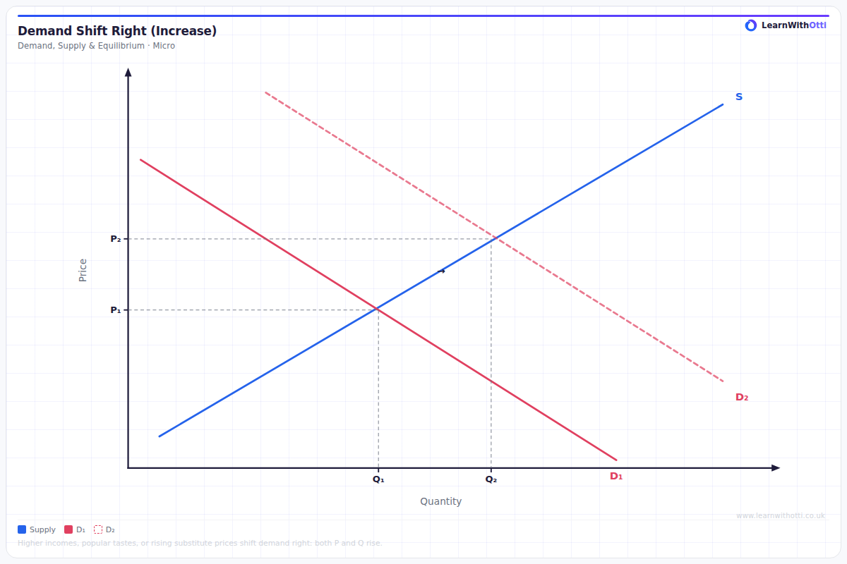
Diagram showing a rightward shift of the demand curve, leading to higher equilibrium price and quantity. Used to analyse factors increasing demand such as rising incomes or changing tastes.
Printable preview
Download a static PNG of this diagram to print or include in revision notes.
Download PNGWhat this diagram shows
This diagram shows an increase in demand, where the entire demand curve shifts to the right from D1 to D2. This shift occurs when non-price factors make consumers willing and able to buy more of a good at every price level. The result is a new market equilibrium with both a higher price (P1 to P2) and higher quantity (Q1 to Q2), demonstrating how changes in demand conditions affect market outcomes.
Key points
- The demand curve shifts right (outward) when demand increases due to non-price factors
- Common causes include: rise in consumer income (for normal goods), increase in population, successful advertising, rise in price of substitutes, fall in price of complements
- Both equilibrium price and quantity increase when demand shifts right
- The supply curve remains unchanged - suppliers simply respond to the new market conditions
- This is a shift OF the curve, not a movement ALONG the curve
Exam tip
Always distinguish between a 'movement along' the demand curve (caused by price changes) versus a 'shift of' the demand curve (caused by non-price factors). Examiners are impressed when students clearly label both the original and new equilibrium points and explain the cause of the shift before analyzing the effects.
Common mistakes
Students often confuse a rightward shift in demand with a movement along the demand curve caused by a price change. They also frequently forget to explain what non-price factor caused the demand shift in the first place.
Exam board notes
All major exam boards treat this diagram identically. However, Edexcel and OCR occasionally ask students to calculate the exact changes in consumer surplus following a demand shift, while AQA focuses more on explaining the causes and consequences.
Related diagrams
Ask Otti about this diagram
Our AI tutor can walk you through every curve, explain exam technique, and quiz you on it.