Demand Shift Left (Decrease in Demand)
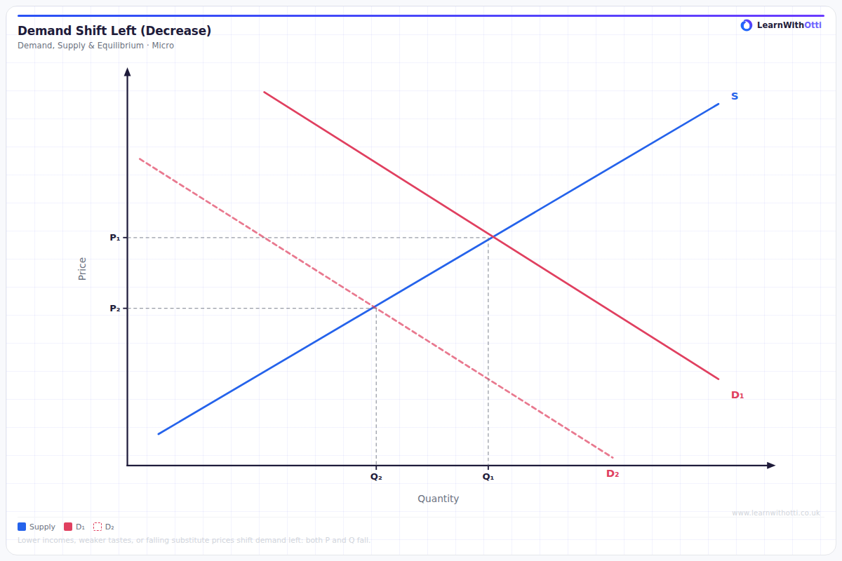
Diagram showing a leftward shift of the demand curve, leading to lower equilibrium price and quantity. Used to analyse factors decreasing demand such as falling incomes or a substitute becoming cheaper.
Printable preview
Download a static PNG of this diagram to print or include in revision notes.
Download PNGWhat this diagram shows
A leftward shift of the demand curve represents a decrease in demand, meaning consumers are willing and able to buy less of a good at every possible price level. This shift is caused by non-price factors such as falling consumer income (for normal goods), declining population, negative changes in consumer tastes, or expectations of future price decreases. The result is a new market equilibrium with both a lower equilibrium price and lower equilibrium quantity. This diagram is fundamental for understanding how external factors influence market outcomes beyond simple price changes.
Key points
- The entire demand curve shifts left/inward, showing decreased demand at all price levels
- Caused by non-price factors: falling income (normal goods), declining population, negative taste changes, substitute goods becoming cheaper, or expectations of future price falls
- Results in a new equilibrium with lower price AND lower quantity traded
- The magnitude of the shift depends on how significantly the non-price factor has changed
- Must distinguish this from a movement along the demand curve, which is caused by price changes only
Exam tip
Examiners are impressed when students clearly distinguish between a 'change in quantity demanded' (movement along the curve) versus a 'change in demand' (shift of the entire curve). Always explain what caused the leftward shift by identifying the specific non-price factor, such as falling consumer income for normal goods or changing consumer preferences.
Common mistakes
Students often confuse a decrease in demand (curve shift) with a decrease in quantity demanded (movement along curve caused by price change). Another frequent error is failing to identify the specific non-price determinant that caused the shift when answering exam questions.
Exam board notes
All major exam boards treat this diagram identically. However, Edexcel and AQA tend to favour questions combining demand shifts with supply shifts in their higher-mark questions, while OCR often links demand shifts to specific markets like housing or labour.
Related diagrams
Ask Otti about this diagram
Our AI tutor can walk you through every curve, explain exam technique, and quiz you on it.