Supply Shift Left (Decrease in Supply)
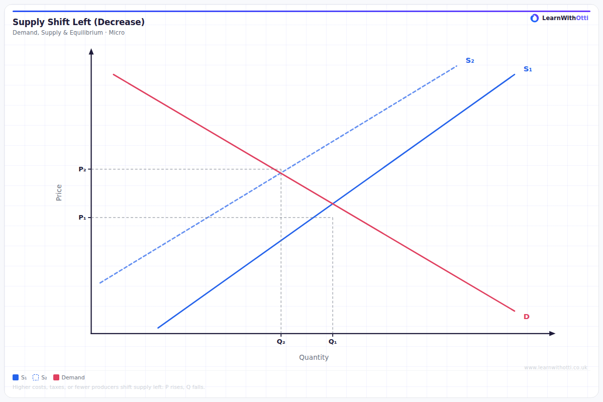
Diagram showing a leftward shift of the supply curve, leading to higher equilibrium price and lower quantity. Used to analyse cost increases, raw material shortages, or taxes.
Printable preview
Download a static PNG of this diagram to print or include in revision notes.
Download PNGWhat this diagram shows
A leftward shift in supply occurs when producers are willing and able to supply less of a good at every price level. This shift results in a higher equilibrium price and lower equilibrium quantity in the market. The shift represents a fundamental change in supply conditions, not a movement along the existing supply curve. Understanding supply shifts is crucial for analysing how market disruptions affect prices and quantities traded.
Key points
- The entire supply curve shifts left/upward, showing decreased supply at all price levels
- Equilibrium moves from the original point to a new point with higher price and lower quantity
- Caused by factors like increased production costs, reduced technology, fewer suppliers, or adverse government policies
- Results in market disequilibrium temporarily before settling at the new equilibrium point
- The extent of price rise and quantity fall depends on the price elasticity of demand
Exam tip
Always explain WHY supply has decreased by identifying the specific factor causing the shift - don't just describe what the diagram shows. Examiners are impressed when you link the supply decrease to real-world examples like increased production costs or reduced number of suppliers.
Common mistakes
Students often confuse a decrease in supply (curve shift) with a decrease in quantity supplied (movement along the curve). They also frequently forget to clearly label both the old and new equilibrium points when drawing the diagram.
Exam board notes
All major exam boards treat this diagram identically, focusing on the same key concepts of supply shifts, equilibrium changes, and underlying causes. The terminology and analytical approach remain consistent across AQA, Edexcel, OCR and CIE specifications.
Related diagrams
Ask Otti about this diagram
Our AI tutor can walk you through every curve, explain exam technique, and quiz you on it.