Equilibrium Shifts — Both Curves Shift Up
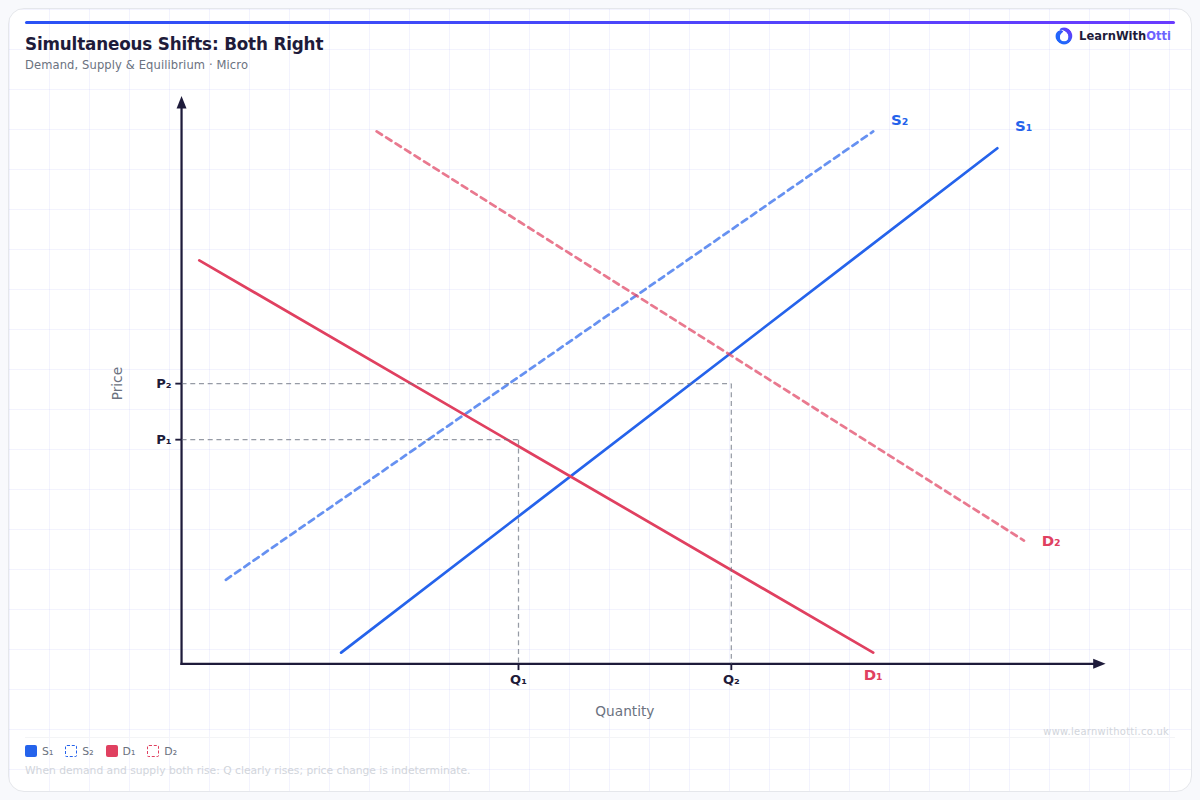
Diagram showing simultaneous rightward shifts of both supply and demand, with the net effect on equilibrium price ambiguous and equilibrium quantity rising.
Printable preview
Download a static PNG of this diagram to print or include in revision notes.
Download PNGWhat this diagram shows
This diagram shows what happens when both supply and demand curves shift upward simultaneously - demand increases (shifts right) while supply decreases (shifts left). Both shifts push price upward, so we can definitively say price will rise. However, the effect on quantity is ambiguous because increased demand pushes quantity up while decreased supply pushes quantity down - the final outcome depends on which shift is larger.
Key points
- Both curves shifting upward means demand increases and supply decreases occurring at the same time
- Price will definitely increase because both shifts push price in the same direction (upward)
- The effect on equilibrium quantity is indeterminate - it depends on the relative magnitude of each shift
- If demand shift > supply shift, quantity increases; if supply shift > demand shift, quantity decreases
- Real-world examples include markets affected by simultaneous demand boosts and supply disruptions (e.g., popular products facing production costs rising)
Exam tip
Students often panic when both curves shift, but the key is to analyse each shift separately first, then combine the effects. Examiners are impressed when you clearly state which effect is stronger and explain why this determines the final outcome for price and quantity.
Common mistakes
Students frequently try to guess the quantity outcome without considering the relative sizes of the shifts, or assume quantity must increase just because demand increased. The crucial error is not recognising that quantity change is indeterminate without additional information about which shift dominates.
Exam board notes
All major exam boards treat this diagram identically, expecting students to recognise the definite price increase and indeterminate quantity effect. The key difference lies in question phrasing - some boards ask you to 'analyse the possible outcomes' while others ask you to 'explain why the quantity effect is uncertain'.
Related diagrams
Ask Otti about this diagram
Our AI tutor can walk you through every curve, explain exam technique, and quiz you on it.