Supply & Demand Equilibrium
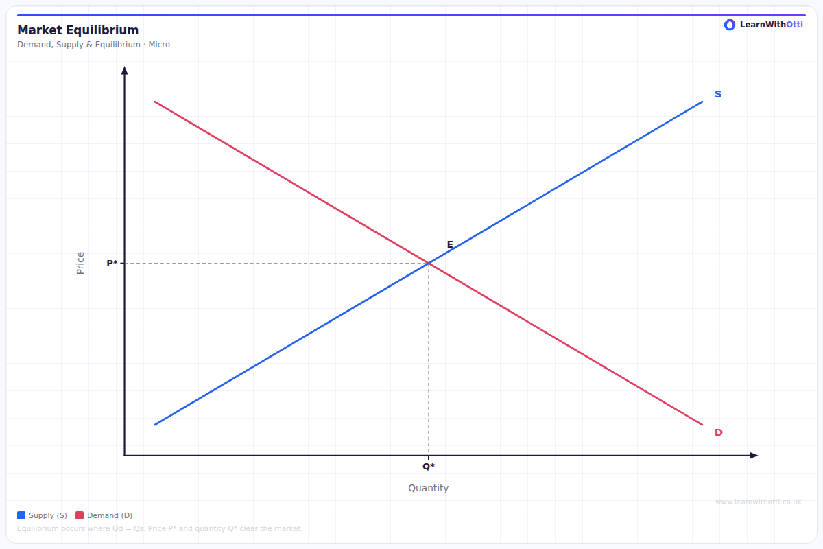
Standard supply and demand diagram showing market equilibrium where quantity demanded equals quantity supplied, determining the equilibrium price and quantity.
Printable preview
Download a static PNG of this diagram to print or include in revision notes.
Download PNGWhat this diagram shows
The supply and demand equilibrium diagram shows where the supply curve intersects with the demand curve, creating the market equilibrium point. This intersection determines both the equilibrium price and quantity that will exist in a free market. At this point, the quantity demanded by consumers exactly equals the quantity supplied by producers, meaning the market 'clears' with no excess supply or demand. This diagram is fundamental to understanding how prices are determined in market economies.
Key points
- Equilibrium occurs where supply curve intersects demand curve (quantity demanded = quantity supplied)
- Equilibrium price (Pe) is determined at the intersection point and represents the market-clearing price
- Equilibrium quantity (Qe) shows the amount bought and sold at the equilibrium price
- Above equilibrium price there's excess supply (surplus), below equilibrium price there's excess demand (shortage)
- Market forces automatically push the price towards equilibrium through competition between buyers and sellers
Exam tip
Always label your equilibrium point as 'E' and clearly show both the equilibrium price (Pe) and equilibrium quantity (Qe) with dotted lines to the axes. Examiners are impressed when you explain that equilibrium represents market clearing - where there's no shortage or surplus.
Common mistakes
Students often fail to show that equilibrium quantity is the same point on both curves - they draw different quantities for supply and demand. Another common error is not understanding that equilibrium represents a balance, not just any intersection point.
Exam board notes
All major exam boards treat this diagram identically. However, OCR tends to emphasize the mathematical relationship more heavily, while AQA focuses more on the real-world applications and market implications.
Related diagrams
Ask Otti about this diagram
Our AI tutor can walk you through every curve, explain exam technique, and quiz you on it.