Consumer & Producer Surplus
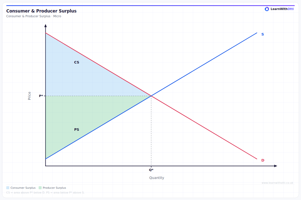
Diagram showing consumer surplus (area above price and below demand curve) and producer surplus (area below price and above supply curve) at market equilibrium.
Printable preview
Download a static PNG of this diagram to print or include in revision notes.
Download PNGWhat this diagram shows
This diagram shows consumer and producer surplus - the benefits that buyers and sellers receive from market transactions. Consumer surplus is the triangular area above the equilibrium price and below the demand curve, representing the extra value consumers get from paying less than they were willing to pay. Producer surplus is the triangular area below the equilibrium price and above the supply curve, showing the extra profit producers make from selling at higher prices than their minimum acceptable price. Together, these surpluses demonstrate how free markets create welfare gains for society.
Key points
- Consumer surplus = area between demand curve and market price (triangle above price, below demand)
- Producer surplus = area between supply curve and market price (triangle below price, above supply)
- At market equilibrium, total welfare (consumer + producer surplus) is maximised
- Changes in price will redistribute surplus between consumers and producers
- Market interventions like taxes or price controls typically reduce total surplus, creating deadweight loss
Exam tip
Always clearly label the areas of consumer and producer surplus on your diagram - examiners look for accurate shading and labelling. Students often impress by explaining that the total welfare (consumer surplus + producer surplus) is maximised at market equilibrium, showing deep understanding of allocative efficiency.
Common mistakes
Students frequently confuse which surplus goes where - remember consumer surplus is always above the price line. Many also forget that the market equilibrium point maximises total welfare, which is crucial for evaluating government interventions.
Exam board notes
All major exam boards treat this diagram identically. However, OCR tends to ask more application questions requiring students to calculate numerical values of surplus areas, while AQA focuses more on the theoretical implications for welfare and efficiency.
Related diagrams
Ask Otti about this diagram
Our AI tutor can walk you through every curve, explain exam technique, and quiz you on it.