Subsidy — Government Subsidy Effect
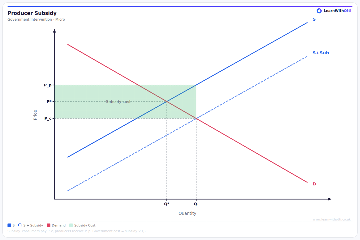
Supply and demand diagram showing the effect of a per-unit government subsidy: rightward supply shift, lower consumer price, higher producer price, subsidy cost rectangle.
Printable preview
Download a static PNG of this diagram to print or include in revision notes.
Download PNGWhat this diagram shows
This diagram illustrates how government subsidies affect market outcomes by shifting the supply curve downward and to the right. A subsidy is a payment from the government to producers, effectively reducing their production costs and encouraging increased output. The diagram shows how this intervention leads to a lower market price for consumers, higher quantity produced and consumed, and demonstrates the total cost to the government. This is a crucial concept for understanding how governments can correct market failures and achieve policy objectives.
Key points
- Supply curve shifts downward/rightward by the exact amount of the per-unit subsidy
- Market price falls from P1 to P2, benefiting consumers through lower prices
- Quantity increases from Q1 to Q2, showing increased market activity
- Total government expenditure equals the subsidy per unit multiplied by the new quantity (shown as shaded rectangle)
- Producers receive P3 per unit (P2 + subsidy) while consumers pay P2, creating a price wedge
Exam tip
Always clearly label both the original and new supply curves when drawing subsidy diagrams - examiners frequently award marks for accurate labelling. Students often forget to show the vertical distance between the curves equals the per-unit subsidy amount.
Common mistakes
Students frequently confuse the direction of the supply curve shift, incorrectly showing it moving upward instead of downward. Many also fail to distinguish between the price consumers pay (P2) and the price producers effectively receive (P3).
Exam board notes
All major exam boards treat this diagram identically, requiring students to show the supply curve shift, price and quantity changes, and government expenditure calculation. Some boards may emphasise different policy contexts in their questions.
Related diagrams
Ask Otti about this diagram
Our AI tutor can walk you through every curve, explain exam technique, and quiz you on it.