Indirect Tax — Ad Valorem Tax
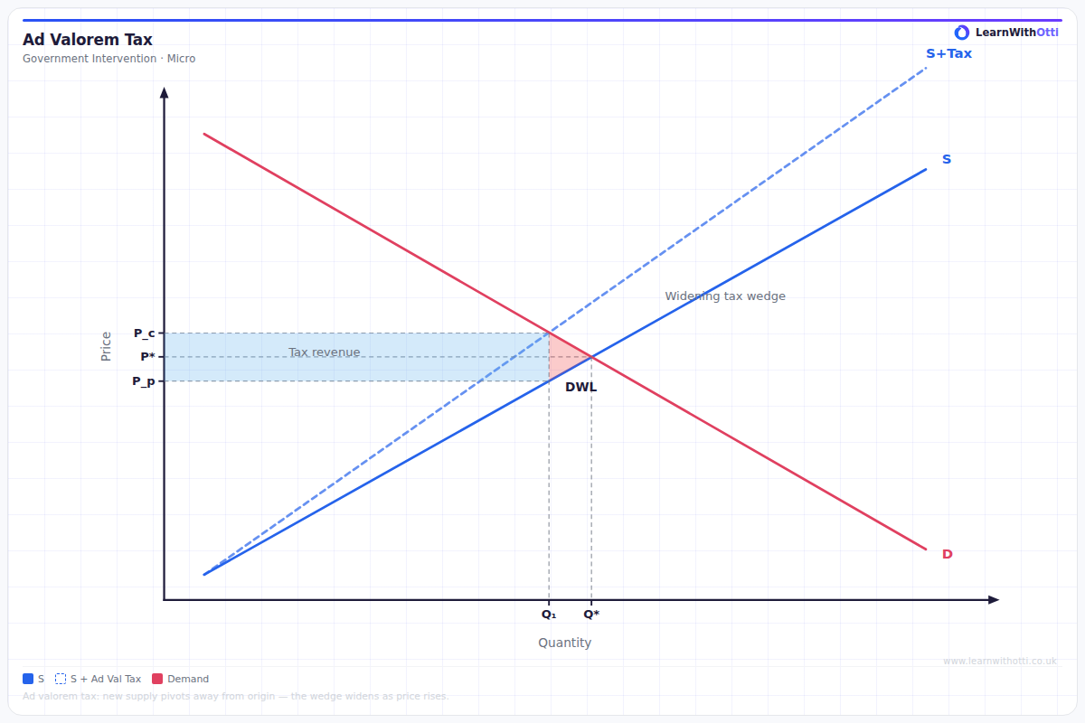
Supply and demand diagram showing the effect of a percentage (ad valorem) tax, which rotates the supply curve, widening the tax wedge at higher quantities.
Printable preview
Download a static PNG of this diagram to print or include in revision notes.
Download PNGWhat this diagram shows
An ad valorem tax diagram shows how a percentage-based indirect tax (like VAT) affects market equilibrium by shifting the supply curve upward. Unlike specific taxes which add a fixed amount, ad valorem taxes create a proportionally larger tax burden as the product price increases. This type of government intervention reduces quantity traded while increasing the price paid by consumers and decreasing the price received by producers. Understanding this diagram is crucial for analyzing real-world policies like VAT, as it demonstrates how percentage-based taxes distribute the burden between consumers and producers.
Key points
- The supply curve shifts upward by the percentage rate of tax, creating a parallel shift that increases with price level
- Tax revenue equals the tax rate multiplied by quantity sold, shown as a rectangular area between the two supply curves
- Consumer burden and producer burden depend on price elasticity of demand and supply - more inelastic side bears greater burden
- Deadweight loss occurs due to reduced quantity traded, shown as a triangular area between the curves
- The tax wedge (difference between price paid and price received) increases proportionally with the product's price
Exam tip
Students often confuse ad valorem taxes with specific taxes - remember that ad valorem taxes are percentage-based, so the tax wedge increases as price increases. Examiners are impressed when students correctly identify that the supply curve shifts parallel upward by a percentage, not a fixed amount.
Common mistakes
Students frequently draw the supply curve shifting by a fixed amount rather than by a percentage, making it identical to a specific tax diagram. They also often miscalculate the tax revenue rectangle by using the wrong price points or forgetting that quantity decreases after the tax.
Exam board notes
All major exam boards treat this diagram identically, requiring students to distinguish between ad valorem and specific taxes and analyze their different impacts on market outcomes. Some specifications emphasize calculating tax incidence more heavily than others.
Related diagrams
Ask Otti about this diagram
Our AI tutor can walk you through every curve, explain exam technique, and quiz you on it.