Indirect Tax — Specific (Unit) Tax
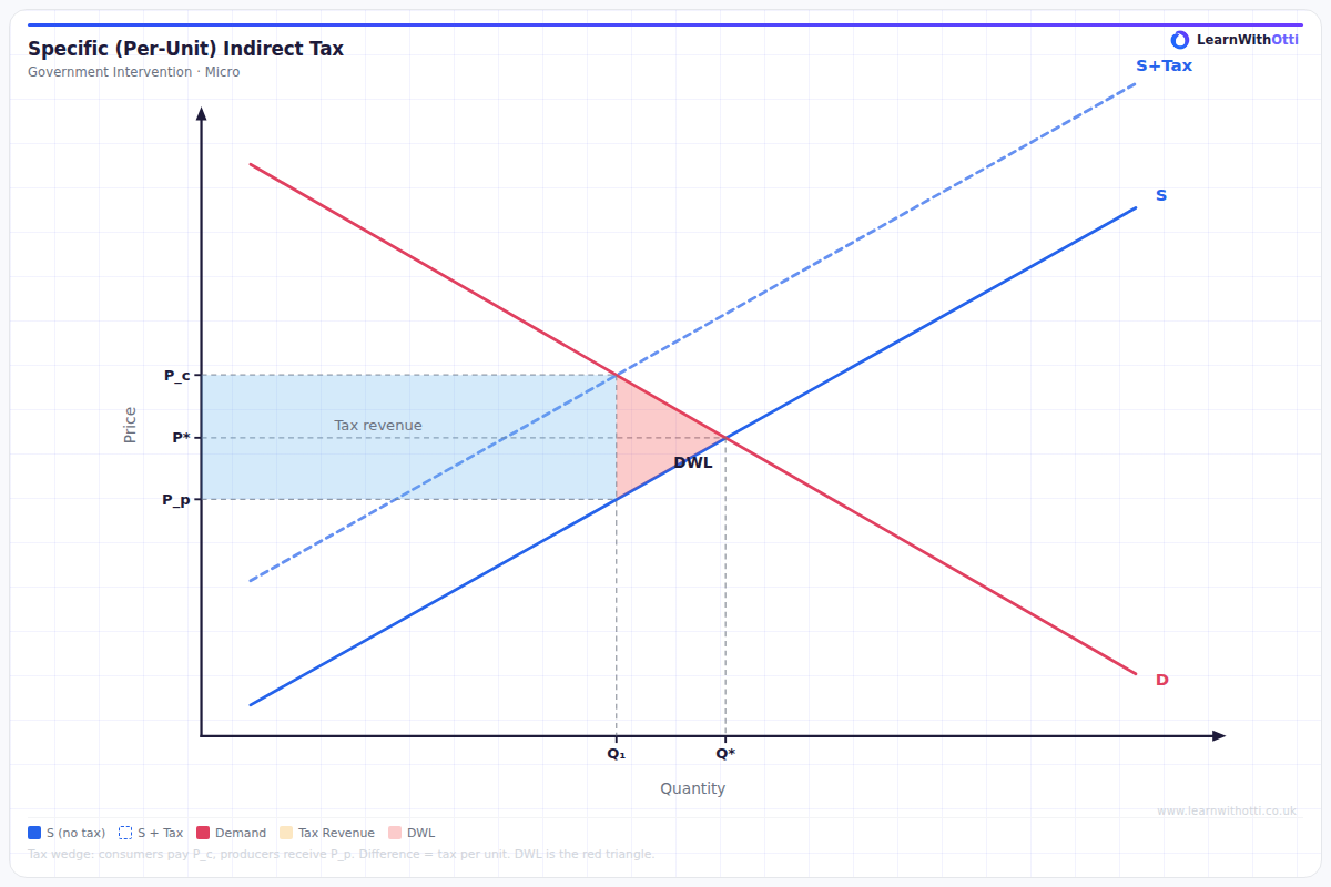
Supply and demand diagram showing the effect of a specific per-unit tax: leftward supply shift, rise in consumer price, fall in producer price, tax revenue rectangle, and deadweight loss.
Printable preview
Download a static PNG of this diagram to print or include in revision notes.
Download PNGWhat this diagram shows
This diagram shows how a specific (unit) tax affects a market by shifting the supply curve vertically upward by the exact amount of the tax per unit. Unlike percentage-based taxes, a specific tax adds a fixed amount to the cost of each unit produced, creating a parallel shift in supply. The diagram demonstrates how the tax burden is shared between consumers (who pay higher prices) and producers (who receive lower net prices), with the government collecting tax revenue shown as a rectangle.
Key points
- Supply curve shifts vertically upward by the exact tax amount per unit, creating a parallel shift (S to S+tax)
- Consumer price rises from P1 to P2, but by less than the full tax amount
- Producer receives P3 (net of tax), which is lower than the original price P1
- Tax incidence depends on price elasticity - the more inelastic side bears more burden
- Government tax revenue equals tax per unit × quantity sold (rectangle P2,P3,Q2)
- Deadweight loss triangle shows efficiency loss from reduced market activity
Exam tip
Students often confuse specific taxes with ad valorem taxes - remember that specific taxes create a PARALLEL shift in the supply curve (same vertical distance at every quantity), not a pivotal shift. Examiners are impressed when you can calculate the exact tax revenue rectangle and explain why the incidence depends on relative elasticities.
Common mistakes
Students frequently draw the supply curve shifting by different amounts at different quantities, when it should shift by the same vertical distance throughout. They also often forget to show that producers receive less than consumers pay, missing the key point about tax incidence.
Exam board notes
All major exam boards treat this diagram identically, though Edexcel sometimes emphasises calculating numerical values for tax revenue and deadweight loss. CIE occasionally asks students to compare specific vs ad valorem taxes on the same diagram.
Related diagrams
Ask Otti about this diagram
Our AI tutor can walk you through every curve, explain exam technique, and quiz you on it.