Deadweight Loss (Welfare Loss Triangle)
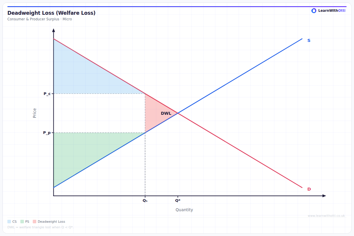
Diagram showing the welfare loss triangle created when output deviates from the allocatively efficient level, as occurs with taxes, price controls, or monopoly.
Printable preview
Download a static PNG of this diagram to print or include in revision notes.
Download PNGWhat this diagram shows
The deadweight loss triangle shows the welfare that is permanently lost to society when markets fail to operate at the socially optimal level. It appears when the quantity produced is either above or below the free market equilibrium, typically due to government intervention like taxes, subsidies, or price controls. The triangle represents mutually beneficial trades between consumers and producers that don't occur, meaning society as a whole is worse off. Understanding this concept is crucial for evaluating the efficiency costs of different economic policies.
Key points
- The triangle is formed between the demand curve, supply curve, and the actual quantity produced/consumed
- It represents lost consumer surplus and producer surplus that cannot be recovered
- Deadweight loss occurs when price ≠ marginal cost, violating allocative efficiency
- The larger the triangle, the greater the welfare loss to society
- It demonstrates why economists generally favor market solutions over interventions that distort prices
Exam tip
Always label the deadweight loss triangle clearly with three vertices: the equilibrium point, and the two points where quantity produced meets the demand and supply curves. Examiners are impressed when students can explain that deadweight loss represents transactions that would benefit both consumers and producers but don't happen due to market failure.
Common mistakes
Students often confuse deadweight loss with the redistribution of surplus from consumers to producers (or vice versa). Remember that deadweight loss is surplus that disappears entirely from the economy, not surplus that simply changes hands between different groups.
Exam board notes
All major exam boards treat this diagram identically, though OCR tends to ask more frequently about deadweight loss in the context of monopoly power, while AQA often links it to government intervention scenarios.
Related diagrams
Ask Otti about this diagram
Our AI tutor can walk you through every curve, explain exam technique, and quiz you on it.