Monopoly — Profit Maximisation
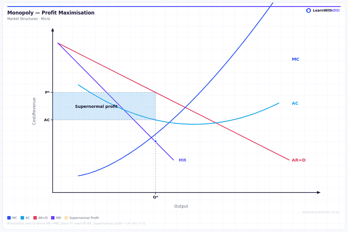
Classic monopoly diagram with downward-sloping AR = Demand, MR below AR, and profit-maximising output at MR = MC, showing supernormal profit and deadweight welfare loss.
Printable preview
Download a static PNG of this diagram to print or include in revision notes.
Download PNGWhat this diagram shows
This diagram shows how a monopolist determines the profit-maximising price and output level by producing where marginal revenue equals marginal cost (MR = MC). Unlike competitive firms, monopolists face a downward-sloping demand curve and can set prices above marginal cost, earning supernormal profits shown by the shaded rectangle. The diagram illustrates the key characteristics of monopoly pricing power and why monopolists can maintain long-run profits. Understanding this diagram is essential for comparing monopoly outcomes with other market structures and analysing welfare effects.
Key points
- Profit maximisation occurs where MR = MC, determining the optimal output level
- Price is set on the demand curve (AR) above the MC curve, showing monopoly pricing power
- Supernormal profit is the rectangle between price and average cost (AC) at the profit-maximising output
- The marginal revenue curve lies below the average revenue curve due to the downward-sloping demand
- Barriers to entry allow the monopolist to maintain supernormal profits in the long run
Exam tip
Always clearly label the profit-maximising output where MR = MC, and shade the supernormal profit rectangle correctly between AR and AC curves. Examiners are impressed when students explain that the monopolist can maintain these profits in the long run due to barriers to entry, unlike perfect competition.
Common mistakes
Students often incorrectly read the price from where MR = MC instead of projecting up to the demand curve (AR). Another frequent error is mislabelling the profit rectangle or forgetting to explain why monopolists can maintain long-run supernormal profits.
Exam board notes
All major exam boards treat this diagram identically, though OCR tends to emphasise the welfare loss triangle more heavily in related questions. Some boards may ask students to sketch the diagram from memory, so practice drawing it accurately.
Related diagrams
Ask Otti about this diagram
Our AI tutor can walk you through every curve, explain exam technique, and quiz you on it.