Natural Monopoly
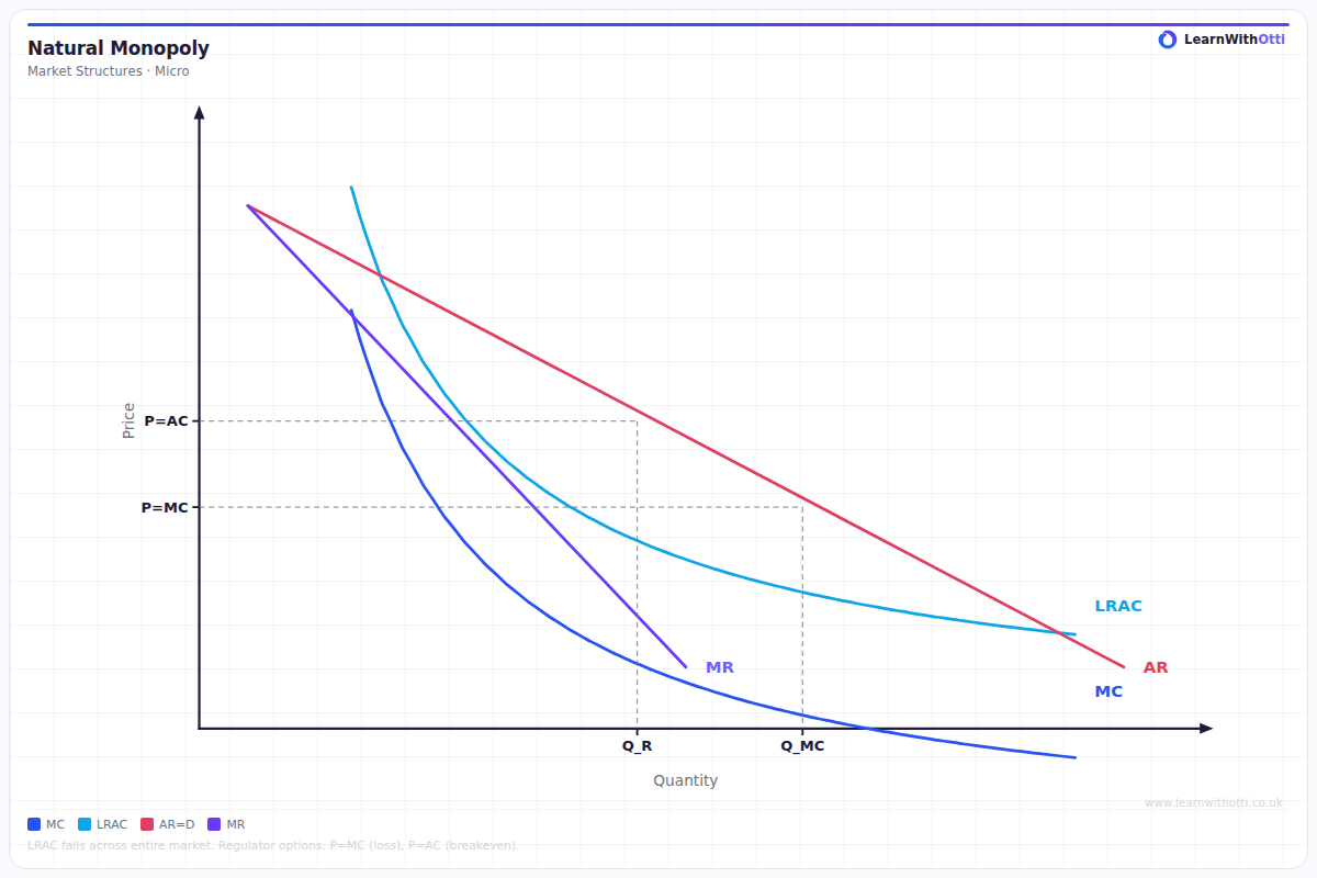
Diagram showing a natural monopoly where the LRAC is still falling across the entire relevant range of demand, making a single producer the most efficient market structure.
Printable preview
Download a static PNG of this diagram to print or include in revision notes.
Download PNGWhat this diagram shows
A natural monopoly diagram shows a market where it's most efficient to have just one firm because of enormous fixed costs and economies of scale. The key feature is that the Long Run Average Cost (LRAC) curve is still decreasing when it meets market demand, meaning average costs would be higher with multiple smaller firms. This typically occurs in utility industries like water, gas, and electricity where infrastructure costs are massive. The diagram demonstrates why governments often regulate these monopolies or provide the service themselves.
Key points
- LRAC curve is still falling (downward sloping) at the point where it intersects market demand
- Huge fixed costs and significant economies of scale make it inefficient to have multiple firms
- Average costs would be higher if the market was split between several smaller firms
- Common in utility industries (water, gas, electricity) and transport infrastructure
- Government regulation is often needed to prevent exploitation of monopoly power while maintaining efficiency
Exam tip
Always explain WHY natural monopoly occurs - emphasise that huge fixed costs mean the LRAC curve is still falling at the market demand level. Examiners are impressed when students can explain that having multiple firms would be wasteful and increase costs for consumers.
Common mistakes
Students often confuse natural monopoly with regular monopoly and forget to emphasise the cost advantage of having one firm. They also frequently fail to explain that the LRAC must still be falling at the market demand level for it to be truly 'natural'.
Exam board notes
All major exam boards treat this diagram identically, though OCR tends to emphasise the regulatory aspects more heavily. Some boards may ask students to evaluate whether natural monopolies should be nationalised or remain in private hands with regulation.
Related diagrams
Ask Otti about this diagram
Our AI tutor can walk you through every curve, explain exam technique, and quiz you on it.