Long-Run Average Cost (LRAC) Curve
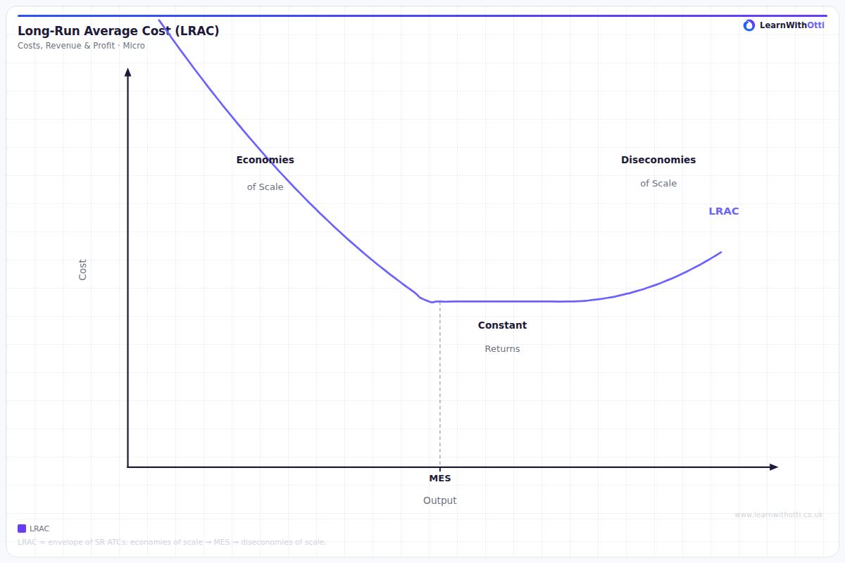
U-shaped LRAC curve (envelope curve) showing economies of scale, the minimum efficient scale, and diseconomies of scale in the long run.
Printable preview
Download a static PNG of this diagram to print or include in revision notes.
Download PNGWhat this diagram shows
The Long-Run Average Cost (LRAC) curve shows the lowest possible average cost of production for each level of output when a firm can vary all its factors of production. Unlike short-run costs where some factors are fixed, in the long run everything can be changed - factory size, machinery, workforce, etc. The curve is typically U-shaped because firms initially benefit from economies of scale (falling average costs) but eventually experience diseconomies of scale (rising average costs). This diagram is crucial for understanding optimal firm size and production decisions.
Key points
- The LRAC curve is the 'envelope' of all possible short-run average cost (SRAC) curves, showing the minimum cost for each output level
- The downward-sloping section reflects economies of scale (internal and external), where average costs fall as output increases
- The upward-sloping section shows diseconomies of scale, where coordination problems and inefficiencies cause average costs to rise
- The minimum point represents the firm's minimum efficient scale (MES) - the output level with lowest long-run average cost
- Firms can move along the LRAC curve by changing plant size and all other inputs, unlike the short-run where some factors are fixed
Exam tip
Always explain WHY the LRAC curve is U-shaped by linking it to economies and diseconomies of scale - don't just describe the shape. Examiners are impressed when students can explain how different short-run average cost curves are tangent to the LRAC curve, showing how firms can adjust all factors of production in the long run.
Common mistakes
Students often confuse the LRAC with short-run average cost curves and fail to explain that ALL factors can be varied in the long run. Many also forget to explain the economic reasons (economies/diseconomies of scale) behind the curve's U-shape.
Exam board notes
All major exam boards treat this diagram identically, though Edexcel and CIE sometimes place slightly more emphasis on linking LRAC to market structure and barriers to entry in their mark schemes.
Related diagrams
Ask Otti about this diagram
Our AI tutor can walk you through every curve, explain exam technique, and quiz you on it.