Short-Run Costs (TC, TFC, TVC)
Diagram showing total cost, total fixed cost, and total variable cost curves in the short run, illustrating how costs change as output increases.
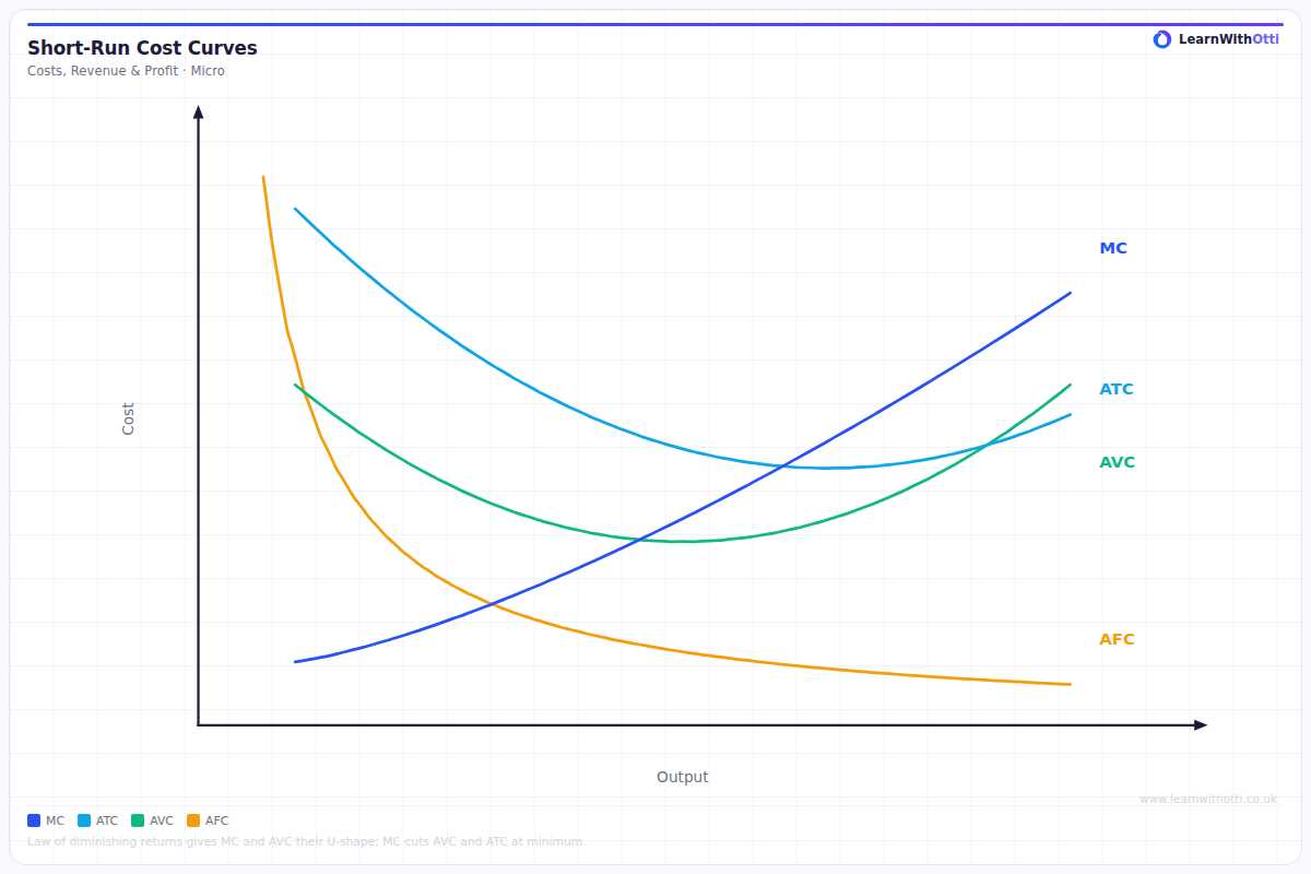
Printable preview
Download a static PNG of this diagram to print or include in revision notes.
Download PNGWhat this diagram shows
This diagram illustrates the three fundamental short-run cost curves that every firm faces when production capacity is fixed. Total Fixed Costs (TFC) appear as a horizontal line because these costs (like rent, insurance, loan repayments) must be paid regardless of how much the firm produces. Total Variable Costs (TVC) start at zero and rise as output increases, reflecting costs that vary with production like raw materials and hourly wages. Total Costs (TC) is simply the vertical sum of TFC and TVC, showing the complete cost burden at each output level.
Key points
- TFC is horizontal because fixed costs remain constant at all output levels in the short run
- TVC starts at zero because no variable costs are incurred when output is zero
- TC = TFC + TVC at every output level, so TC runs parallel to TVC
- The vertical distance between TC and TVC always equals TFC
- All three curves are measured in total monetary amounts (£) on the y-axis against quantity of output on the x-axis
Exam tip
Always emphasize that TFC remains constant regardless of output level - this horizontal line is crucial for showing fixed costs don't change in the short run. Examiners are impressed when students explain that TC starts at the same point as TFC on the y-axis because when output is zero, total costs equal fixed costs.
Common mistakes
Students often confuse this with average cost curves or mistakenly draw TFC as sloping downward instead of horizontal. Another frequent error is not starting TVC at zero or failing to show that TC begins at the same level as TFC when output is zero.
Exam board notes
All major exam boards treat this diagram identically, though OCR and CIE occasionally emphasize the mathematical relationship TC = TFC + TVC more explicitly in their mark schemes.
Related diagrams
Ask Otti about this diagram
Our AI tutor can walk you through every curve, explain exam technique, and quiz you on it.