TC, TFC and TVC Curves
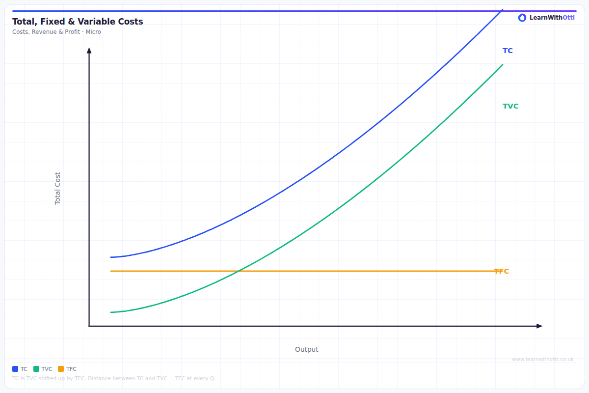
Detailed diagram of total cost, total fixed cost, and total variable cost curves showing the vertical gap (fixed costs) and the shape driven by diminishing marginal returns.
Printable preview
Download a static PNG of this diagram to print or include in revision notes.
Download PNGWhat this diagram shows
This diagram shows the relationship between Total Cost (TC), Total Fixed Cost (TFC), and Total Variable Cost (TVC) as output increases. TFC appears as a horizontal line because fixed costs don't change with output, while TVC starts at zero and rises as more units are produced. TC is simply TFC plus TVC, so it's always the same vertical distance above TVC. Understanding this relationship is crucial for analyzing how production costs behave and forms the foundation for calculating average and marginal costs.
Key points
- TFC is horizontal because fixed costs (rent, insurance, etc.) don't change with output level
- TVC starts at zero and rises with output as more variable inputs (labor, materials) are needed
- TC = TFC + TVC, so TC is always a fixed vertical distance above TVC
- Both TC and TVC have the same slope at any output level because they increase by the same amount (marginal cost)
- The shape of TVC (and therefore TC) typically shows increasing returns initially, then diminishing returns as the curve gets steeper
Exam tip
Always label the vertical distance between TC and TVC as TFC - this shows you understand that total costs are the sum of fixed and variable costs. Examiners are impressed when students can explain why TFC remains constant regardless of output level and why TC and TVC have identical slopes at any given output.
Common mistakes
Students often incorrectly draw TC starting at zero instead of starting at the TFC level. Another frequent error is making the vertical gap between TC and TVC change as output increases, when it should remain constant.
Exam board notes
All major exam boards treat this diagram identically, though OCR sometimes places more emphasis on linking these curves to the law of diminishing returns in their mark schemes.
Related diagrams
Ask Otti about this diagram
Our AI tutor can walk you through every curve, explain exam technique, and quiz you on it.