Price Ceiling (Maximum Price)
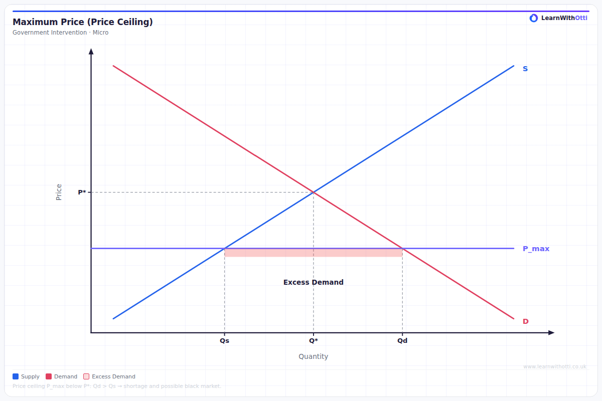
Diagram showing the effect of a government-imposed maximum price set below equilibrium, creating excess demand (shortage) and reducing total welfare.
Printable preview
Download a static PNG of this diagram to print or include in revision notes.
Download PNGWhat this diagram shows
A price ceiling diagram shows what happens when the government sets a maximum legal price below the free market equilibrium price. This creates excess demand (shortage) because consumers want to buy more at the lower price while producers are willing to supply less. Price ceilings are typically used to make essential goods more affordable, such as rent controls on housing or maximum prices on basic foodstuffs during crises.
Key points
- The price ceiling must be set below the equilibrium price to be effective - if set above equilibrium, it has no impact
- Consumer surplus increases for those who can buy the good, but decreases overall due to lost transactions
- Producer surplus always decreases as they receive lower prices and sell smaller quantities
- Deadweight loss occurs due to allocative inefficiency - beneficial trades that would occur at equilibrium are prevented
- Secondary effects include black markets, queues, rationing systems, and potential quality deterioration
Exam tip
Always clearly label the shortage created by the price ceiling - this is the horizontal distance between quantity demanded and quantity supplied at the ceiling price. Examiners are impressed when students can explain the unintended consequences like black markets, queues, or deteriorating quality that result from this shortage.
Common mistakes
Students often incorrectly draw the price ceiling above the equilibrium price, which would make it ineffective. They also frequently forget to shade or clearly identify the deadweight loss triangle formed between the demand curve, supply curve, and the quantity actually traded.
Exam board notes
All major exam boards treat this diagram identically. However, AQA and Edexcel tend to ask more application questions about real-world examples like rent controls, while OCR focuses more on the theoretical welfare analysis.
Related diagrams
Ask Otti about this diagram
Our AI tutor can walk you through every curve, explain exam technique, and quiz you on it.