Price Floor (Minimum Price)
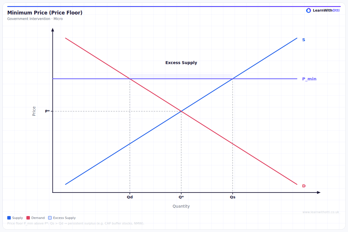
Diagram showing the effect of a government-imposed minimum price set above equilibrium, creating excess supply (surplus) and reducing total welfare.
Printable preview
Download a static PNG of this diagram to print or include in revision notes.
Download PNGWhat this diagram shows
A price floor diagram shows what happens when government sets a minimum price above the market equilibrium, creating artificial scarcity through pricing. The most common example is minimum wage, but it also applies to agricultural price supports. This intervention creates a surplus because quantity supplied exceeds quantity demanded at the artificially high price. Understanding price floors is crucial for analysing government intervention effects and market efficiency.
Key points
- Price floor must be set ABOVE equilibrium price to be effective - if set below, market forces will push price up naturally
- Creates surplus (excess supply) as quantity supplied exceeds quantity demanded at the minimum price
- Reduces consumer surplus and overall economic welfare, creating deadweight loss
- Benefits some producers (those who can still sell) but harms others (those priced out of market)
- Government may need to buy surplus or find ways to dispose of excess supply
Exam tip
Always clearly label the surplus area and explain what happens to it - examiners want to see you understand that the surplus represents wasted resources that create deadweight loss. Students who can explain the real-world consequences of the surplus (like butter mountains in the EU) demonstrate deeper understanding.
Common mistakes
Students often draw the price floor below the equilibrium price, which would have no effect since market forces would push price up anyway. They also frequently forget to shade and explain the deadweight loss area, missing a key evaluation point about economic inefficiency.
Exam board notes
All major exam boards treat this diagram identically, though OCR tends to emphasise real-world applications like EU Common Agricultural Policy more heavily in exam questions.
Related diagrams
Ask Otti about this diagram
Our AI tutor can walk you through every curve, explain exam technique, and quiz you on it.