National Minimum Wage
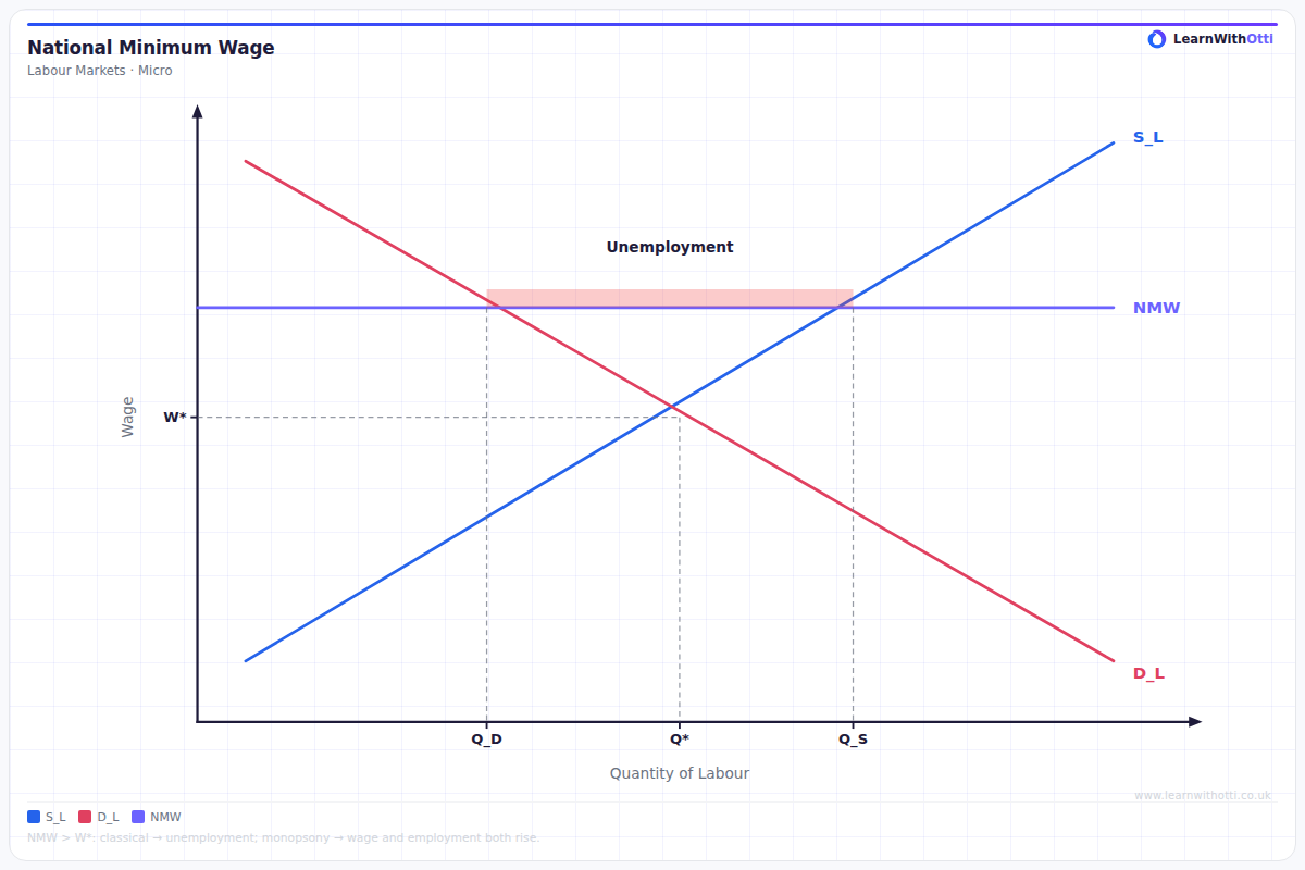
Labour market diagram showing a minimum wage set above equilibrium, creating unemployment (excess supply of labour) or reducing it in a monopsony market.
Printable preview
Download a static PNG of this diagram to print or include in revision notes.
Download PNGWhat this diagram shows
The National Minimum Wage diagram shows what happens when government sets a wage floor above the market equilibrium in a competitive labour market. It demonstrates the classic trade-off between higher wages for those who keep their jobs versus reduced employment opportunities overall. This creates both unemployment (as fewer workers are demanded) and excess labour supply (as more workers are attracted by higher wages), illustrating why minimum wage policies remain economically controversial.
Key points
- The minimum wage is set as a horizontal line above the equilibrium wage rate, creating a price floor
- Employment falls from the equilibrium level as firms demand fewer workers at the higher wage
- Unemployment increases due to both job losses and additional workers entering the market attracted by higher wages
- The total unemployment equals the difference between labour supply and labour demand at the minimum wage level
- Workers who keep their jobs benefit from higher wages, while those who lose jobs or cannot find work are worse off
Exam tip
Always clearly label the minimum wage as a horizontal line above the equilibrium wage rate, and show both the reduction in employment AND the increase in unemployment (these are different!). Examiners are impressed when students distinguish between the original workers who lose their jobs and the additional workers attracted by higher wages who cannot find employment.
Common mistakes
Students often confuse the reduction in employment with the total unemployment, forgetting that unemployment includes both displaced workers and new entrants attracted by higher wages. Many also incorrectly draw the minimum wage below the equilibrium wage, which would make it ineffective.
Exam board notes
All major exam boards treat this diagram identically, though OCR and CIE sometimes emphasise the welfare loss triangles more explicitly. AQA and Edexcel focus more on the employment effects and policy implications in their mark schemes.
Related diagrams
Ask Otti about this diagram
Our AI tutor can walk you through every curve, explain exam technique, and quiz you on it.