Marginal Revenue Product (MRP) Theory
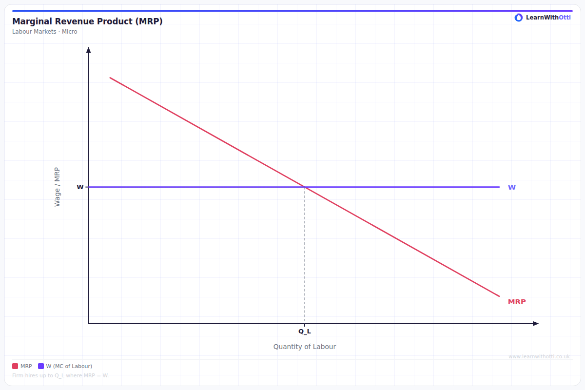
Diagram showing the MRP curve as the labour demand curve, derived from diminishing returns, and used to determine the profit-maximising level of employment.
Printable preview
Download a static PNG of this diagram to print or include in revision notes.
Download PNGWhat this diagram shows
The Marginal Revenue Product (MRP) theory diagram shows how firms decide how many workers to employ based on the additional revenue each worker generates. The downward-sloping MRP curve represents the extra revenue produced by each additional worker, which falls due to the law of diminishing marginal returns. This diagram is crucial because it explains wage determination in competitive labor markets - firms will hire workers up to the point where the wage rate equals the MRP. Understanding this helps explain why wages differ between industries and why productivity improvements lead to higher wages.
Key points
- MRP = Marginal Physical Product × Price of output, showing the revenue contribution of each additional worker
- The MRP curve slopes downward due to diminishing marginal returns - each extra worker adds less output than the previous one
- Profit-maximizing firms hire workers where MRP = wage rate, as hiring beyond this point would reduce profits
- An increase in productivity or output price shifts the MRP curve rightward, leading to higher employment and wages
- The MRP curve acts as the firm's demand curve for labor, determining how employment responds to wage changes
Exam tip
Always show the connection between MRP and wage determination clearly - examiners love to see students explain that the profit-maximizing firm will hire workers up to the point where MRP equals the wage rate. Don't just describe the curve - explain why it slopes downward and what happens when MRP changes due to productivity or price changes.
Common mistakes
Students often confuse marginal physical product with marginal revenue product, forgetting that MRP includes both the extra output AND the price it sells for. Many also incorrectly assume the MRP curve is the supply curve for labor when it's actually the demand curve.
Exam board notes
All major exam boards treat this diagram identically, though Edexcel tends to place slightly more emphasis on numerical calculations of MRP values. CIE occasionally includes more complex scenarios involving monopolistic firms where MRP calculations differ from competitive markets.
Related diagrams
Ask Otti about this diagram
Our AI tutor can walk you through every curve, explain exam technique, and quiz you on it.