Wage Discrimination and the Gender Pay Gap
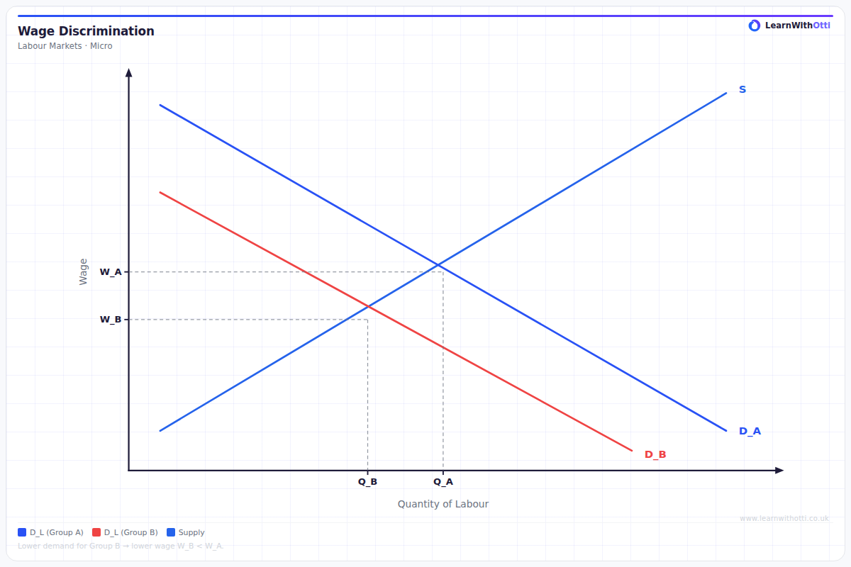
Labour market diagram illustrating wage discrimination, showing how identical workers in different groups are paid below their MRP, creating a welfare loss.
Printable preview
Download a static PNG of this diagram to print or include in revision notes.
Download PNGWhat this diagram shows
This diagram illustrates how wage discrimination creates different wage rates for equally productive workers, typically showing male and female workers receiving different pay despite identical marginal revenue productivity. It demonstrates market failure where wages don't reflect true productivity, often caused by employer prejudice, statistical discrimination, or occupational segregation. The diagram is crucial for understanding persistent gender pay gaps and provides evidence for potential government intervention in labour markets.
Key points
- Shows identical marginal revenue productivity curves for both groups but different wage outcomes
- Demonstrates that discrimination creates allocative inefficiency in labour markets
- Illustrates how employer prejudice can shift effective labour demand curves downward for certain groups
- Explains persistent wage gaps even when human capital and productivity are equal
- Shows the welfare loss to society from underutilising productive workers
Exam tip
Examiners are impressed when students clearly distinguish between different causes of wage discrimination (taste-based vs statistical discrimination) and link this to market failure. Avoid simply describing the gap - always explain the underlying economic mechanisms causing the differential.
Common mistakes
Students often confuse wage discrimination with productivity differences, failing to show that both groups have identical MRP curves. They also frequently forget to explain why this represents market failure and economic inefficiency.
Exam board notes
All major exam boards treat this diagram identically, though OCR tends to emphasise the welfare economics aspects more heavily. Some specifications may link this more explicitly to government intervention policies.
Related diagrams
Ask Otti about this diagram
Our AI tutor can walk you through every curve, explain exam technique, and quiz you on it.