Gini Coefficient — Country Comparison
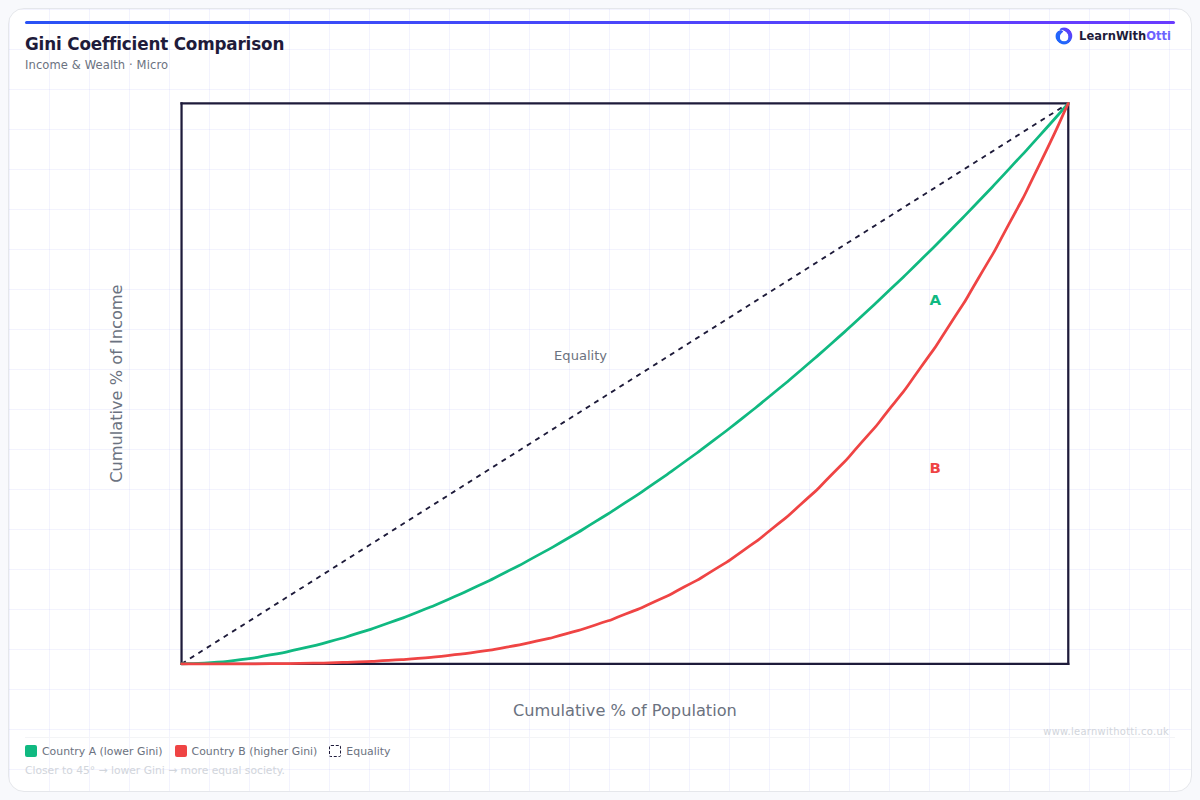
Diagram comparing Lorenz curves for two countries with different Gini coefficients, illustrating relative income inequality and its change over time.
Printable preview
Download a static PNG of this diagram to print or include in revision notes.
Download PNGWhat this diagram shows
This diagram compares Gini coefficients across different countries, showing how income inequality varies globally. The Gini coefficient ranges from 0 (perfect equality) to 1 (perfect inequality), with most countries falling between 0.25-0.65. Countries like Denmark and Sweden typically show lower coefficients (more equal), while countries like South Africa and Brazil show higher coefficients (more unequal). This comparison helps economists understand the relationship between development, government policy, and income distribution.
Key points
- Gini coefficient scale: 0 = perfect equality, 1 = perfect inequality (often expressed as 0-100 instead of 0-1)
- Developed countries generally cluster between 0.25-0.40, showing relatively lower inequality
- Many developing countries show higher coefficients (0.40-0.65), often due to dual economies and limited social safety nets
- Nordic countries consistently rank among the most equal, while some African and Latin American countries show highest inequality
- The diagram reveals that high GDP per capita doesn't automatically guarantee low inequality
Exam tip
Students often confuse a higher Gini coefficient with better equality - remember that values closer to 1 indicate GREATER inequality. Examiners are impressed when you can explain why developing countries often show both very high and very low Gini coefficients depending on their development stage.
Common mistakes
Students frequently mix up the scale, thinking higher Gini coefficients mean more equality rather than more inequality. They also often assume all rich countries have low inequality without considering countries like the USA which has relatively high inequality for a developed nation.
Exam board notes
All major exam boards treat this diagram identically, though Edexcel tends to emphasise the policy implications more heavily. CIE occasionally includes more detailed country-specific case studies alongside Gini comparisons.
Related diagrams
Ask Otti about this diagram
Our AI tutor can walk you through every curve, explain exam technique, and quiz you on it.