Lorenz Curve
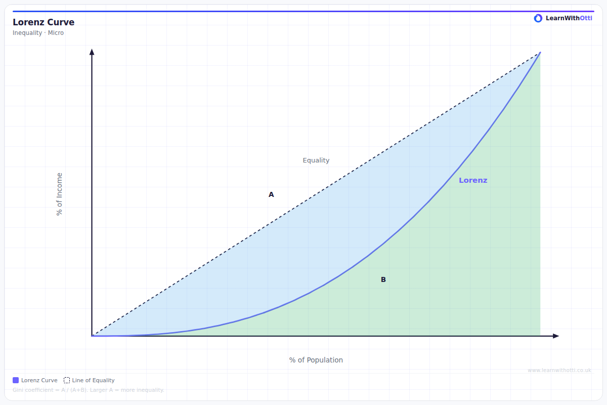
Diagram showing the Lorenz curve measuring income inequality: the further the curve bows from the 45° line of perfect equality, the greater the inequality (Gini coefficient).
Printable preview
Download a static PNG of this diagram to print or include in revision notes.
Download PNGWhat this diagram shows
The Lorenz curve is a graphical representation of income or wealth distribution within a population, showing the cumulative percentage of total income earned by different percentiles of the population. The curve plots against a 45-degree 'line of equality' which represents perfect equality where everyone earns the same income. The further the Lorenz curve bows away from this line of equality, the greater the level of inequality in that economy. This diagram is crucial for understanding and measuring inequality, particularly when calculating the Gini coefficient.
Key points
- The line of equality (45-degree line) represents perfect income equality where each percentage of the population earns that same percentage of total income
- The Lorenz curve always starts at (0,0) and ends at (100,100) - showing 0% of people earn 0% of income, and 100% of people earn 100% of income
- The area between the Lorenz curve and line of equality is used to calculate the Gini coefficient (Area A ÷ Area A+B)
- A curve closer to the line of equality indicates lower inequality, while a curve that bows further away indicates higher inequality
- Real-world Lorenz curves are always below the line of equality (except at the end points) because perfect equality rarely exists
Exam tip
Always label the axes correctly - the x-axis shows cumulative percentage of population (poorest to richest) and the y-axis shows cumulative percentage of income. Examiners are impressed when students can calculate the Gini coefficient from the Lorenz curve by referencing the area between the curve and the line of equality.
Common mistakes
Students often confuse which axis represents population and which represents income, or incorrectly assume the curve can appear above the line of equality. Another frequent error is misunderstanding that the curve shows cumulative percentages, not individual income levels.
Exam board notes
All major exam boards treat this diagram identically, though OCR tends to place slightly more emphasis on calculating and interpreting the Gini coefficient from the Lorenz curve. AQA and Edexcel focus more on using the diagram to compare inequality between countries or time periods.
Related diagrams
Ask Otti about this diagram
Our AI tutor can walk you through every curve, explain exam technique, and quiz you on it.