Laffer Curve
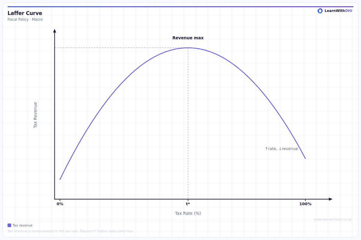
The Laffer Curve showing the relationship between tax rate and tax revenue, illustrating that beyond a peak rate, higher taxes reduce revenue by discouraging economic activity.
Printable preview
Download a static PNG of this diagram to print or include in revision notes.
Download PNGWhat this diagram shows
The Laffer Curve illustrates the relationship between tax rates and total tax revenue collected by the government. It shows that as tax rates increase from 0%, tax revenue initially rises, but beyond a certain point (the optimal tax rate), further increases in tax rates actually reduce total revenue. This happens because higher tax rates create disincentives to work, save and invest, leading to reduced economic activity and tax avoidance. The curve demonstrates that there's an optimal tax rate that maximises government revenue without destroying incentives to be economically productive.
Key points
- At 0% tax rate, government collects no revenue despite maximum economic incentives
- At 100% tax rate, government collects no revenue because there's no incentive to work or produce
- There exists an optimal tax rate that maximises government revenue - this is the peak of the curve
- Beyond the optimal rate, higher taxes reduce revenue due to disincentive effects and increased tax avoidance
- The curve suggests supply-side economists' argument that tax cuts can sometimes increase total tax revenue
Exam tip
Students often incorrectly assume the optimal tax rate is always 50% - this is wrong! The peak of the Laffer Curve varies between countries and over time depending on factors like tax avoidance opportunities and work incentives. Examiners are impressed when students explain that the curve's shape and peak position depend on the specific economic context.
Common mistakes
Students frequently assume the curve is symmetrical and that the optimal tax rate is always at 50%. In reality, the curve is typically asymmetrical and the revenue-maximising point varies significantly between different economies and tax types.
Exam board notes
All major exam boards treat this diagram identically, focusing on the relationship between tax rates and revenue, though some may emphasise different policy applications in their mark schemes.
Related diagrams
Ask Otti about this diagram
Our AI tutor can walk you through every curve, explain exam technique, and quiz you on it.