Expansionary Fiscal Policy
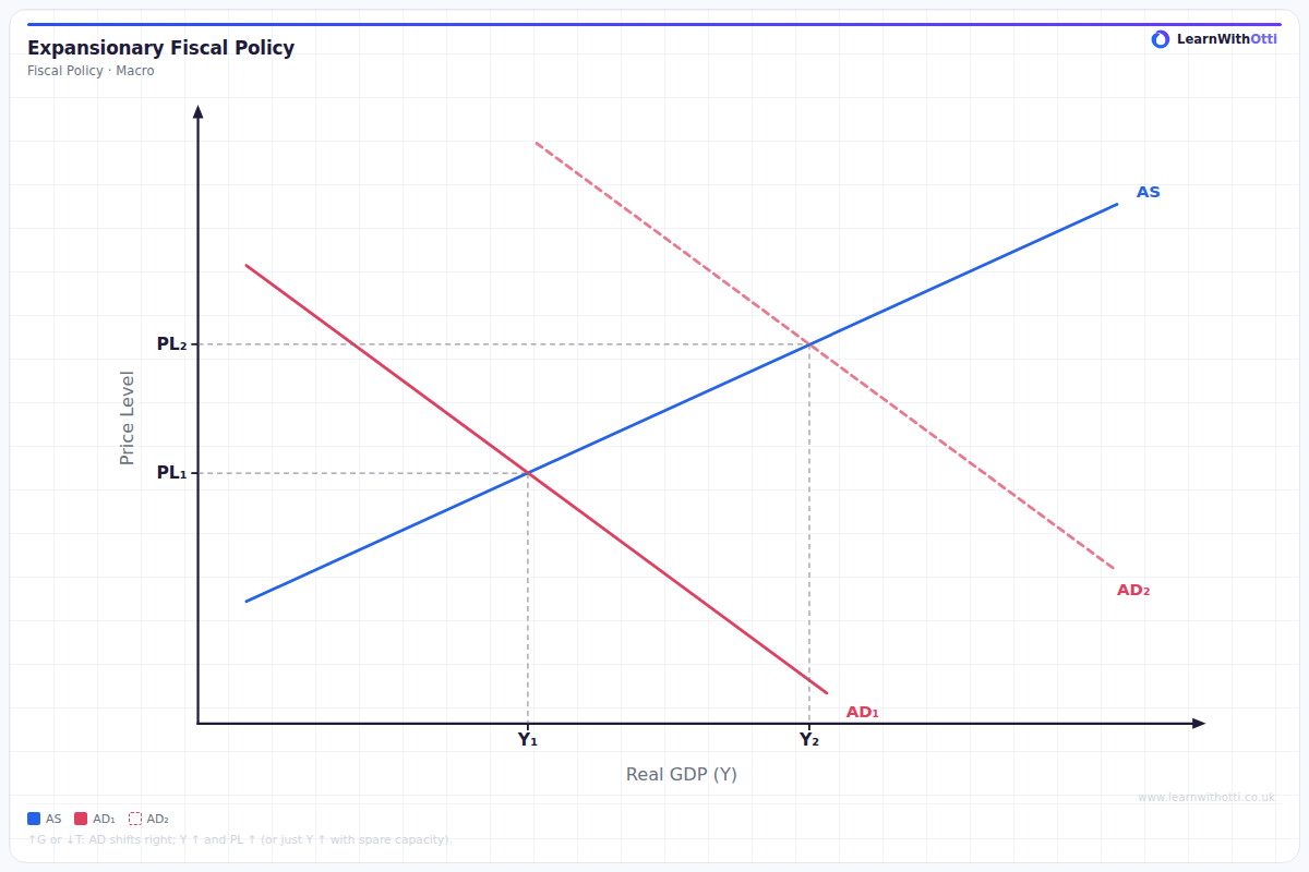
AD/AS diagram showing the effect of an increase in government spending or a tax cut, shifting AD right and raising real GDP (and potentially the price level).
Printable preview
Download a static PNG of this diagram to print or include in revision notes.
Download PNGWhat this diagram shows
This diagram illustrates how expansionary fiscal policy (increased government spending or reduced taxes) shifts aggregate demand rightward from AD₁ to AD₂, leading to higher real GDP and price levels. The economy moves from equilibrium E₁ to E₂, showing how fiscal stimulus can help close a recessionary gap by boosting economic output. This is a fundamental tool governments use during economic downturns to stimulate growth and reduce unemployment, though it comes with the trade-off of higher inflation.
Key points
- Expansionary fiscal policy shifts AD curve rightward through increased government spending (G) or reduced taxes (which increases consumption C)
- The new equilibrium shows higher real GDP (Y₁ to Y₂) and higher price level (PL₁ to PL₂)
- This policy is most effective when there is spare capacity in the economy (elastic SRAS)
- The multiplier effect means the final increase in GDP is larger than the initial injection of government spending
- Time lags exist between policy implementation and economic impact, and the policy may worsen government budget deficits
Exam tip
Always clearly label both the initial and final equilibrium positions (Y₁ to Y₂ and PL₁ to PL₂) and explain the transmission mechanism step-by-step. Examiners are impressed when students explicitly mention that government spending is a component of aggregate demand and therefore any increase directly shifts AD rightward.
Common mistakes
Students often forget to show the inflationary consequence of expansionary fiscal policy, focusing only on the GDP increase. Many also fail to explain that the effectiveness depends on the economy's spare capacity and the slope of the SRAS curve.
Exam board notes
All major exam boards treat this diagram identically, though OCR tends to place slightly more emphasis on evaluating the effectiveness using concepts like spare capacity and time lags.
Related diagrams
Ask Otti about this diagram
Our AI tutor can walk you through every curve, explain exam technique, and quiz you on it.