Monopsony in the Labour Market
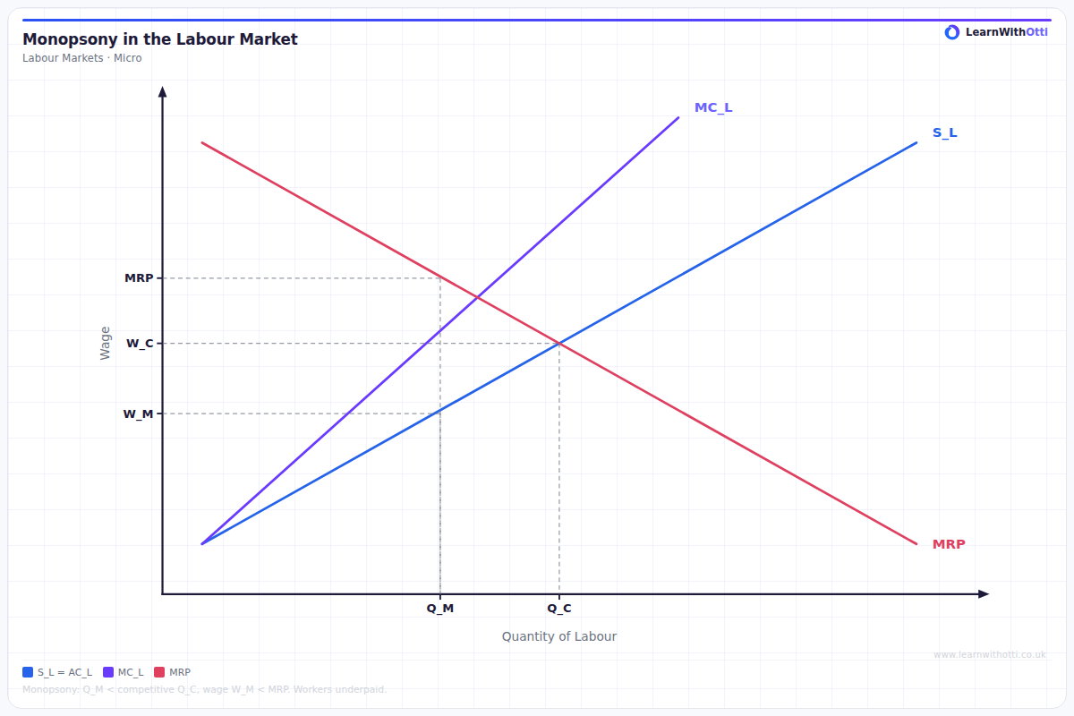
Diagram showing a monopsonist employer who faces an upward-sloping labour supply and MCL above supply, paying a lower wage and employing fewer workers than the competitive outcome.
Printable preview
Download a static PNG of this diagram to print or include in revision notes.
Download PNGWhat this diagram shows
This diagram shows how a monopsony employer (single buyer of labour) determines wages and employment levels differently from a competitive market. The key feature is that the marginal cost of labour (MCL) curve lies above the labour supply curve because the monopsonist must raise wages for all workers when hiring additional workers. This leads to lower wages and employment compared to a competitive market, demonstrating market failure in labour markets.
Key points
- Monopsony equilibrium occurs where MCL = MRP (profit maximisation condition)
- Monopsony wage (Wm) is lower than competitive wage (W*), showing wage exploitation
- Employment level (Lm) is lower than competitive level (L*), creating allocative inefficiency
- The MCL curve is above the supply curve because hiring one more worker increases costs for all existing workers
- The difference between competitive and monopsony outcomes represents deadweight welfare loss
Exam tip
Always clearly label the difference between the wage rate in a competitive market (W*) and the monopsony wage (Wm) - examiners love to see you explicitly identify this wage exploitation. Make sure you can explain why the marginal cost of labour curve is above the supply curve, as this is what distinguishes monopsony from perfect competition.
Common mistakes
Students often incorrectly place the equilibrium at the intersection of supply and demand, forgetting that monopsonists use MCL = MRP. Another frequent error is failing to read the wage from the supply curve - students sometimes read it from the MCL curve instead.
Exam board notes
All major exam boards treat this diagram identically. However, CIE tends to ask more detailed questions about welfare loss calculations, while AQA focuses more on comparing monopsony outcomes with trade union intervention.
Related diagrams
Ask Otti about this diagram
Our AI tutor can walk you through every curve, explain exam technique, and quiz you on it.