Labour Market — Demand and Supply
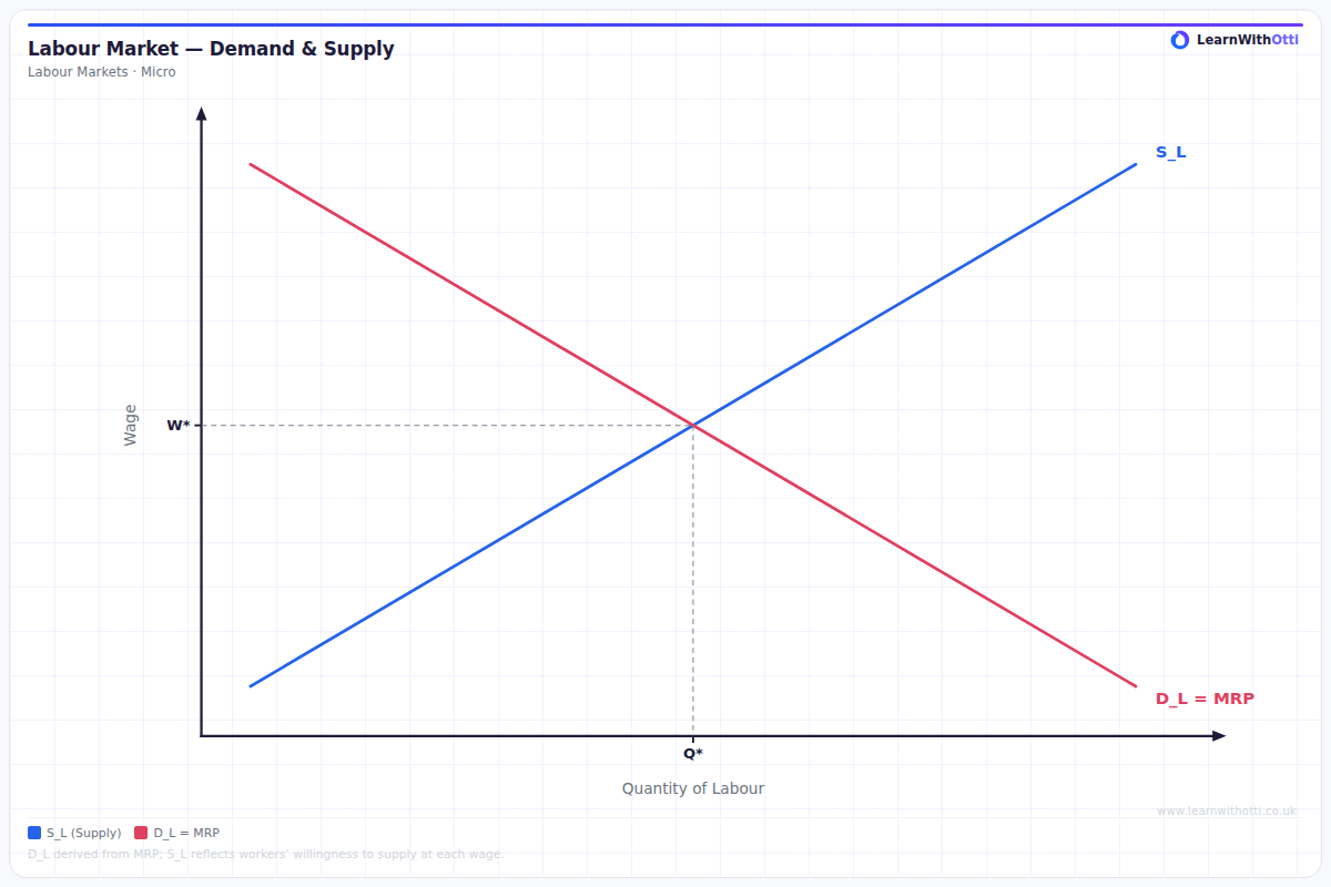
Standard labour market diagram with downward-sloping labour demand (MRP) and upward-sloping labour supply, determining equilibrium wage and employment.
Printable preview
Download a static PNG of this diagram to print or include in revision notes.
Download PNGWhat this diagram shows
The labour market demand and supply diagram shows how wages and employment levels are determined through the interaction of employers (who demand labour) and workers (who supply labour). The demand curve slopes downward because firms hire fewer workers as wages increase, while the supply curve slopes upward as higher wages attract more people to work. The intersection point determines the equilibrium wage rate and employment level in that particular labour market. This model is fundamental for understanding unemployment, wage inequality, and the effects of government intervention in labour markets.
Key points
- Labour demand slopes downward - higher wages lead to lower quantity of labour demanded as firms substitute capital for labour or reduce output
- Labour supply slopes upward - higher wages attract more workers into the market and encourage longer working hours
- Equilibrium occurs where demand equals supply, determining both the wage rate and employment level
- Shifts in demand can be caused by changes in productivity, product demand, or technology
- Shifts in supply result from population changes, education/training levels, or changes in work preferences
Exam tip
Always label your axes correctly - wage rate on the Y-axis and quantity of labour on the X-axis. Examiners are impressed when students can explain movements along curves versus shifts of curves, and link labour market analysis to real-world factors like minimum wages or skills shortages.
Common mistakes
Students often confuse movements along the curves (caused by wage changes) with shifts of entire curves (caused by non-wage factors). They also frequently mix up which factors shift demand versus supply curves.
Exam board notes
All major exam boards treat this diagram identically as it's a fundamental microeconomic model. However, AQA and Edexcel tend to emphasize real-world applications more heavily in their mark schemes.
Related diagrams
Ask Otti about this diagram
Our AI tutor can walk you through every curve, explain exam technique, and quiz you on it.