Positive Externality — Production
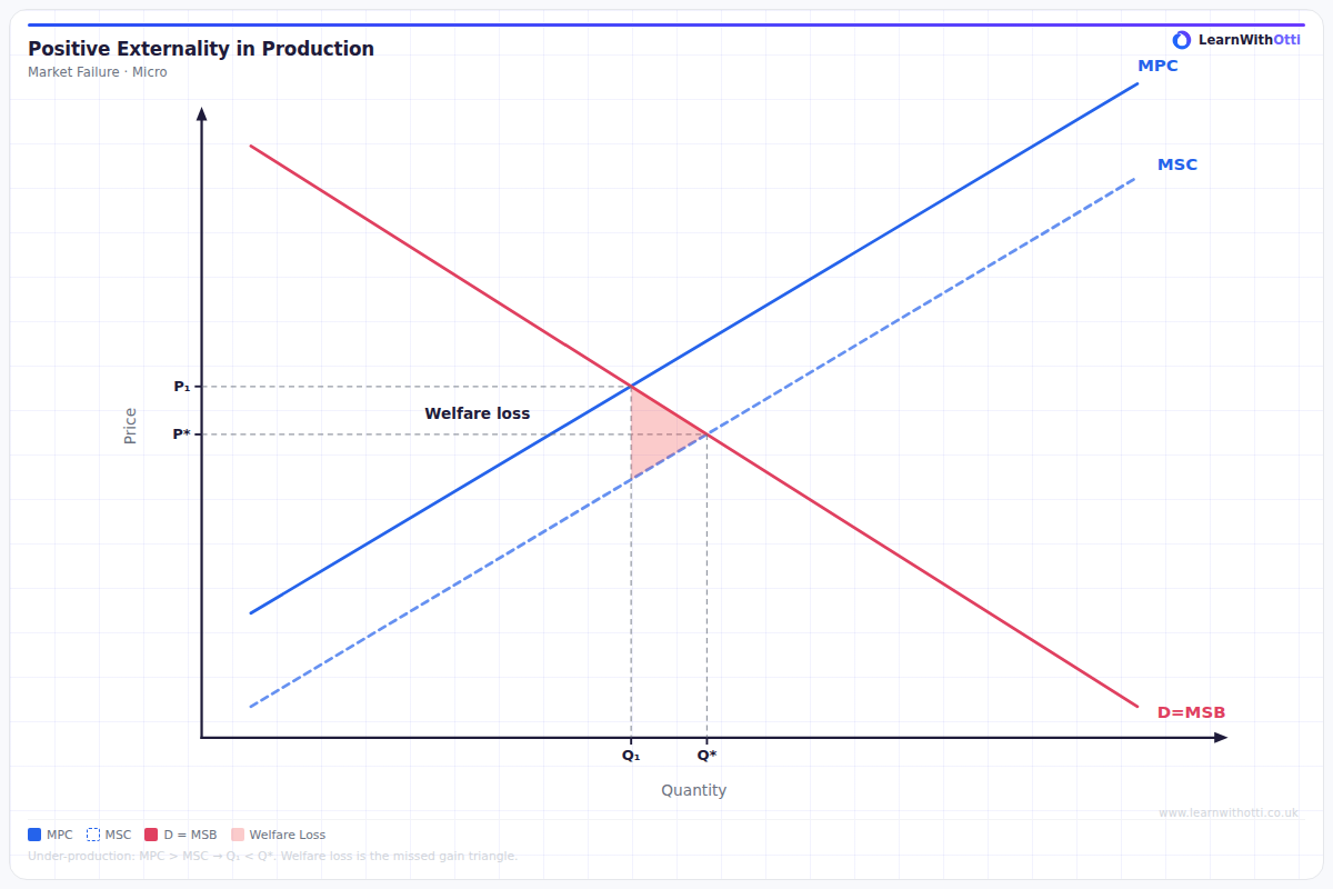
Diagram showing MSC below MPC, with the free market underproducing at Qp and the socially optimal output at Qs (MSC = MPB), with a Pigouvian subsidy restoring optimality.
Printable preview
Download a static PNG of this diagram to print or include in revision notes.
Download PNGWhat this diagram shows
This diagram shows a market where production creates positive externalities - benefits that spill over to third parties who aren't directly involved in the transaction. The marginal social cost (MSC) curve lies below the marginal private cost (MPC) curve because society benefits from additional production beyond what the producer receives. Examples include training workers (who gain transferable skills), research and development (creating knowledge spillovers), or renewable energy production (reducing pollution for everyone).
Key points
- MSC < MPC because positive externalities reduce the true cost to society of producing each additional unit
- The free market produces at Q1 where MPC = MPB, but the socially optimal output is Q2 where MSC = MPB
- This creates under-production and under-consumption - a market failure where society would benefit from more output
- The welfare loss triangle represents the potential benefits to society that are lost due to under-production
- Government intervention through subsidies can shift the supply curve right to achieve the socially optimal output level
Exam tip
Always clearly label the difference between private costs (MPC) and social costs (MSC) - examiners look for this distinction. Students who can explain why MSC lies below MPC due to positive spillover effects to third parties will score highly.
Common mistakes
Students often confuse positive production externalities with consumption externalities, mixing up which curves shift. They also frequently get the direction wrong, showing MSC above MPC instead of below it.
Exam board notes
All major exam boards treat this diagram identically, though OCR tends to emphasize real-world examples more heavily while AQA focuses more on the welfare analysis.
Related diagrams
Ask Otti about this diagram
Our AI tutor can walk you through every curve, explain exam technique, and quiz you on it.