Negative Externality — Production
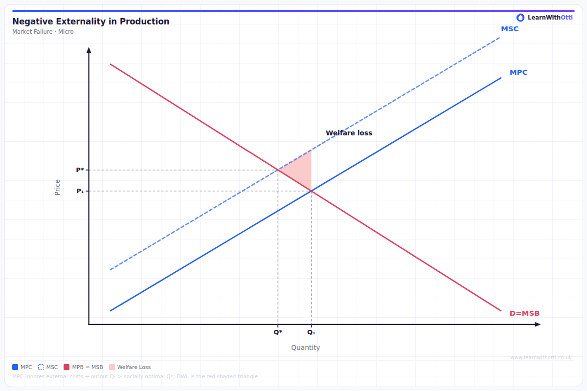
Diagram showing MSC above MPC, with the free market overproducing at Qp and the socially optimal output at Qs (MSC = MPB), along with the welfare loss triangle.
Printable preview
Download a static PNG of this diagram to print or include in revision notes.
Download PNGWhat this diagram shows
This diagram illustrates market failure when production creates negative externalities, such as pollution from a factory. The private cost curve (MPC) only includes costs to the producer, while the social cost curve (MSC) includes both private costs and external costs imposed on society. The free market produces at Q1 where MPC = MPB, but the socially optimal output is Q* where MSC = MSB, showing that too much is being produced and consumed.
Key points
- MSC lies above MPC because external costs (like pollution) are added to private costs
- Free market equilibrium at Q1 ignores external costs, leading to overproduction
- Socially optimal output at Q* would occur if all costs were considered
- The welfare loss triangle shows the net loss to society from overproduction
- Government intervention (taxes, regulations, permits) can shift production toward the social optimum
Exam tip
Always label the welfare loss triangle clearly and explain that it represents the difference between social and private costs. Examiners are impressed when students can calculate the size of deadweight loss using the triangle area formula and explain why the free market produces too much output.
Common mistakes
Students often confuse which curve should be higher, putting MPC above MSC instead of the other way around. They also frequently mislabel the welfare loss triangle or place it in the wrong position on the diagram.
Exam board notes
All major exam boards treat this diagram identically. However, CIE and OCR tend to ask more numerical questions requiring calculation of the welfare loss area, while AQA focuses more on evaluation of policy solutions.
Related diagrams
Ask Otti about this diagram
Our AI tutor can walk you through every curve, explain exam technique, and quiz you on it.