Negative Externality — Consumption
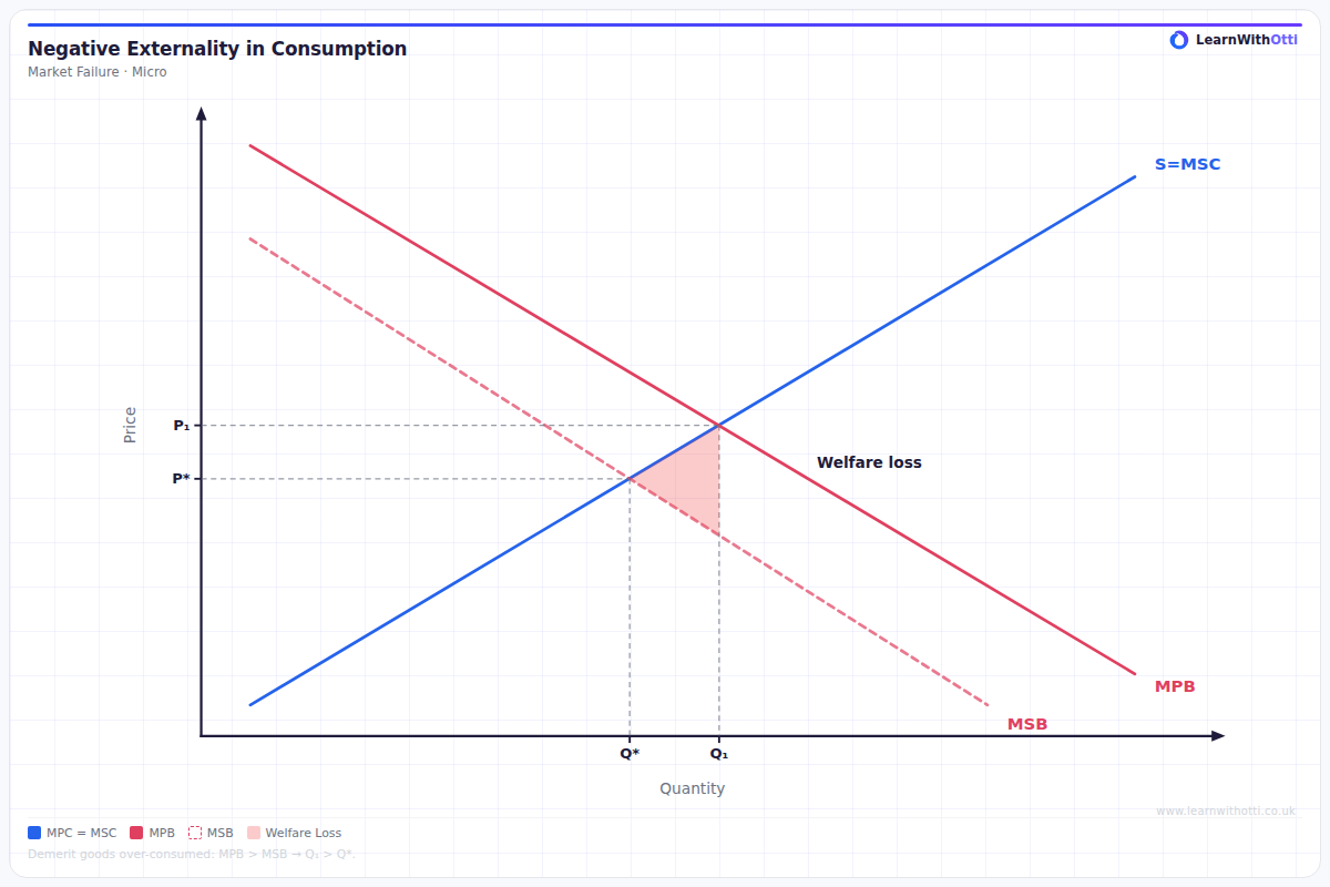
Diagram showing MSB below MPB, with the free market overconsumption at Qp and the socially optimal quantity at Qs (MSB = MSC), illustrating the welfare loss.
Printable preview
Download a static PNG of this diagram to print or include in revision notes.
Download PNGWhat this diagram shows
This diagram illustrates market failure when consuming a good creates negative externalities that harm third parties. The key insight is that consumers only consider their private benefits, ignoring the social costs they impose on others, leading to overconsumption. Examples include smoking (healthcare costs), loud music (noise pollution), or fast food consumption (strain on healthcare system). The market produces more than the socially optimal quantity, creating welfare loss.
Key points
- Private Marginal Benefit (PMB) lies above Social Marginal Benefit (SMB) because external costs reduce society's overall benefit
- Market equilibrium occurs at P1, Q1 where PMB = Supply, but social optimum is at P2, Q2 where SMB = Supply
- The shaded triangle represents deadweight welfare loss from overconsumption (Q2 to Q1)
- Government intervention through taxation, regulation, or advertising campaigns can shift consumption toward the social optimum
- The vertical distance between PMB and SMB represents the monetary value of the negative externality per unit consumed
Exam tip
Always clearly label the welfare loss triangle and explain that it represents overconsumption, not just any deadweight loss. Examiners are impressed when students can explain why the private benefit curve lies above the social benefit curve for negative consumption externalities.
Common mistakes
Students often confuse this with negative production externalities and incorrectly place the curves. The most frequent error is drawing the SMB curve above the PMB curve instead of below it.
Exam board notes
All major exam boards treat this diagram identically. However, AQA tends to emphasize real-world policy solutions more heavily, while OCR often requires more detailed mathematical analysis of the welfare loss triangle.
Related diagrams
Ask Otti about this diagram
Our AI tutor can walk you through every curve, explain exam technique, and quiz you on it.