Export Subsidy
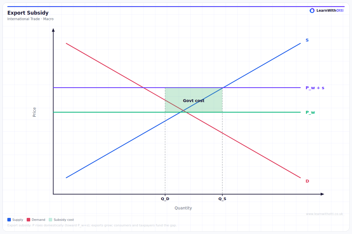
Diagram showing the effect of an export subsidy on domestic and world markets, with domestic consumers paying a higher price and producers receiving the world price plus subsidy.
Printable preview
Download a static PNG of this diagram to print or include in revision notes.
Download PNGWhat this diagram shows
An export subsidy diagram shows how government payments to domestic producers affect international trade and market efficiency. The subsidy allows domestic producers to sell abroad at the world price while receiving additional payment from the government, making exports more profitable. This increases domestic production, reduces domestic consumption, and creates a larger export surplus. However, it also generates deadweight losses and represents a cost to taxpayers, illustrating the trade-offs involved in protectionist policies.
Key points
- The subsidy creates a wedge between the price producers receive (world price + subsidy) and the world price consumers pay
- Domestic production increases while domestic consumption decreases, expanding the volume of exports
- Two deadweight loss triangles are created: one from overproduction and one from underconsumption
- The government faces a fiscal cost equal to the subsidy per unit multiplied by the quantity exported
- Producer surplus increases significantly while consumer surplus decreases, creating redistribution effects
Exam tip
Always clearly distinguish between the domestic price and world price when analysing export subsidies - this is where most students lose marks. Examiners are impressed when you can calculate the deadweight loss triangles and explain why the subsidy creates inefficiency despite boosting exports.
Common mistakes
Students often confuse export subsidies with import tariffs and incorrectly show the domestic price rising above the world price. Many also forget to identify both deadweight loss triangles or miscalculate the total cost to the government.
Exam board notes
All major exam boards treat this diagram identically, focusing on the welfare effects and efficiency losses. Some boards place slightly more emphasis on calculating numerical values for different areas when given specific subsidy amounts.
Related diagrams
Ask Otti about this diagram
Our AI tutor can walk you through every curve, explain exam technique, and quiz you on it.