Import Tariff
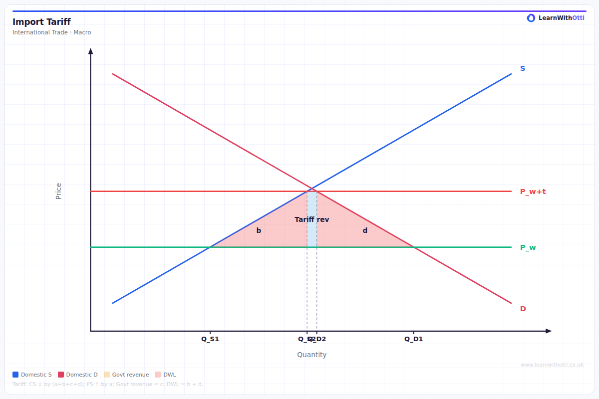
Supply and demand diagram showing the effect of an import tariff: domestic price rises, consumer surplus falls, government gains tariff revenue, and a deadweight loss is created.
Printable preview
Download a static PNG of this diagram to print or include in revision notes.
Download PNGWhat this diagram shows
An import tariff diagram shows how placing a tax on imported goods affects domestic and international markets. The tariff raises the domestic price above the world price, reducing imports while increasing domestic production and generating government revenue. However, this protection comes at a cost - consumer surplus falls significantly, and deadweight losses are created, making society as a whole worse off. This diagram is crucial for understanding trade policy debates and the economic arguments for and against protectionism.
Key points
- The tariff raises domestic price from world price (Pw) to tariff-inclusive price (Pw + tariff)
- Consumer surplus falls (shown by the large area under demand curve up to new price)
- Producer surplus increases (domestic firms benefit from higher prices and increased sales)
- Government gains tariff revenue (rectangle = tariff × quantity of imports)
- Two deadweight loss triangles represent pure economic waste from reduced trade efficiency
Exam tip
Always clearly label the deadweight loss triangles and explain them as pure economic waste - this immediately shows examiners you understand the efficiency costs of tariffs. Many students forget to explain that the tariff revenue rectangle represents a transfer from consumers to government, not a net loss to society.
Common mistakes
Students often incorrectly identify the tariff revenue as a deadweight loss, when it's actually a transfer from consumers to government. They also frequently mislabel or forget to show both deadweight loss triangles - the production inefficiency triangle and the consumption inefficiency triangle.
Exam board notes
All major exam boards treat this diagram identically, though OCR tends to emphasise the welfare analysis more heavily in their mark schemes. Some boards may ask you to calculate the numerical values of the areas if given specific price and quantity data.
Related diagrams
Ask Otti about this diagram
Our AI tutor can walk you through every curve, explain exam technique, and quiz you on it.