Import Quota
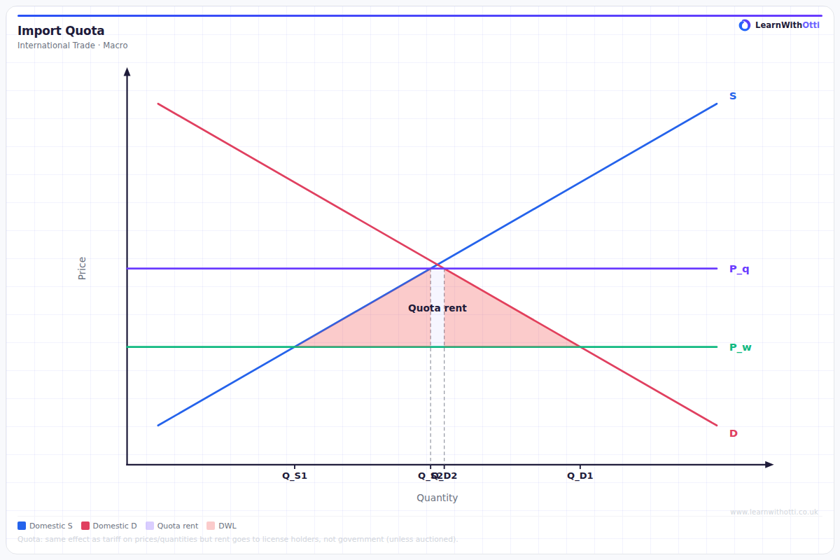
Supply and demand diagram showing the effect of an import quota: domestic price rises above world price, domestic output increases, consumer surplus falls, and a quota rent is created.
Printable preview
Download a static PNG of this diagram to print or include in revision notes.
Download PNGWhat this diagram shows
An import quota diagram shows how government limits on the physical quantity of imports affect domestic markets. Unlike tariffs which use price mechanisms, quotas directly restrict supply by capping imports at a specific quantity, creating an artificial shortage. This protection benefits domestic producers by raising market prices and reducing foreign competition, but harms consumers through higher prices and reduced choice. The diagram demonstrates the welfare effects including deadweight losses and the creation of quota rents.
Key points
- Import quota creates a perfectly inelastic supply curve at the quota limit, unlike the parallel shift seen with tariffs
- Domestic price rises from world price to higher equilibrium price, benefiting domestic producers but harming consumers
- Quota rents are created - the profit made by those holding import licences, representing the price difference times quota quantity
- Deadweight loss occurs from both production and consumption inefficiency triangles
- Domestic production increases while total consumption falls compared to free trade equilibrium
Exam tip
Students often confuse import quotas with tariffs - remember that quotas create a perfectly inelastic supply curve at the quota limit, not a price shift. Examiners are impressed when you clearly explain how the quota creates domestic producer surplus gains and consumer surplus losses, plus the distinctive 'quota rents' that go to licence holders.
Common mistakes
Students frequently draw quota diagrams identical to tariff diagrams, forgetting that quotas create a vertical supply curve at the limit rather than a price increase throughout. Many also forget to identify and explain quota rents as a distinct welfare effect separate from producer and consumer surplus changes.
Exam board notes
All major exam boards treat this diagram identically in terms of core theory. However, Edexcel tends to emphasise numerical calculations of welfare changes more heavily, while AQA often combines quota analysis with evaluation of alternative policy instruments.
Related diagrams
Ask Otti about this diagram
Our AI tutor can walk you through every curve, explain exam technique, and quiz you on it.