Market Surplus After Demand Shift
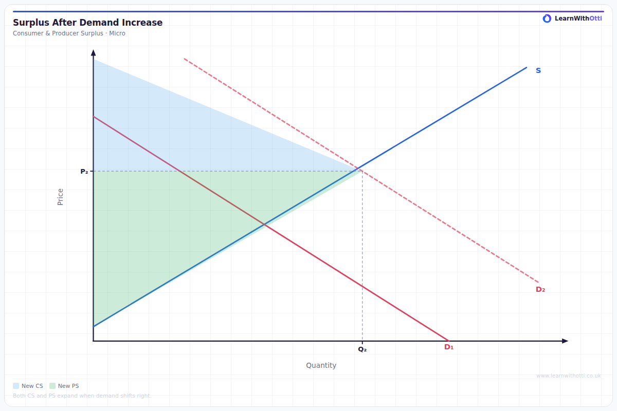
Diagram illustrating how a leftward demand shift creates a market surplus at the original price, and how the price mechanism restores equilibrium.
Printable preview
Download a static PNG of this diagram to print or include in revision notes.
Download PNGWhat this diagram shows
This diagram illustrates what happens when demand decreases (shifts left) while supply remains unchanged, creating a temporary market surplus. At the original price level, quantity supplied now exceeds quantity demanded, showing how external factors affecting demand can disrupt market equilibrium. This concept is crucial for understanding how markets self-correct and why prices fluctuate in response to changing consumer preferences, income levels, or other demand determinants.
Key points
- The demand curve shifts left/downward due to factors like falling consumer income, changing tastes, or substitute goods becoming cheaper
- At the original equilibrium price, quantity supplied exceeds quantity demanded, creating a surplus
- The surplus represents unsold goods, putting downward pressure on price as suppliers compete to clear excess stock
- Market forces will eventually establish a new equilibrium with lower price and lower quantity traded
- This demonstrates how markets automatically adjust to restore balance between supply and demand
Exam tip
Always clearly identify the original equilibrium point before showing the shift, and use precise terminology like 'surplus' rather than vague terms like 'extra supply'. Examiners are impressed when students explain that the surplus will create downward pressure on price, leading to market forces restoring equilibrium.
Common mistakes
Students often confuse a decrease in demand with a decrease in quantity demanded, failing to distinguish between shifts of the curve versus movements along it. Many also forget to explain that the surplus is temporary and will be eliminated through the price mechanism.
Exam board notes
All major exam boards treat this diagram identically, though OCR tends to place slightly more emphasis on explaining the underlying causes of demand shifts in their mark schemes.
Related diagrams
Ask Otti about this diagram
Our AI tutor can walk you through every curve, explain exam technique, and quiz you on it.