Cost-Push Inflation
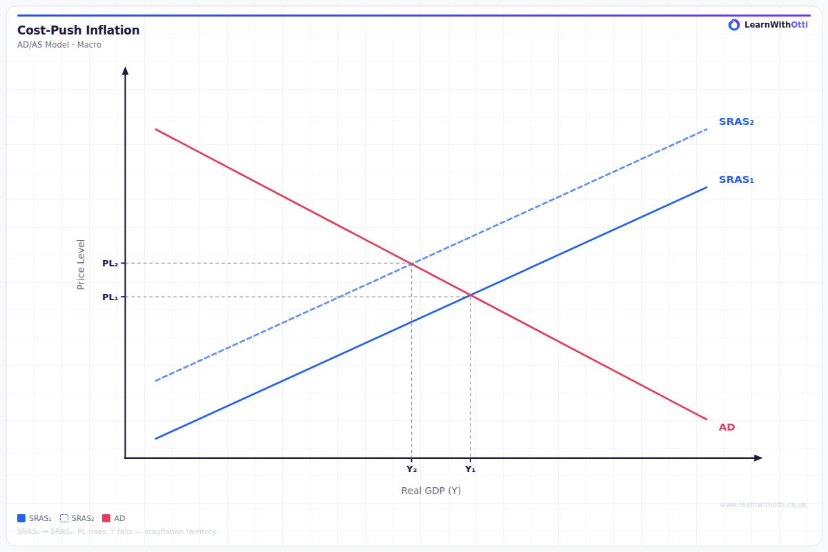
AD/AS diagram showing cost-push inflation where a rise in production costs (wages, energy) shifts SRAS left, raising prices and reducing output simultaneously.
Printable preview
Download a static PNG of this diagram to print or include in revision notes.
Download PNGWhat this diagram shows
This diagram shows how cost-push inflation occurs when rising production costs force firms to increase prices, shifting the Short-Run Aggregate Supply (SRAS) curve leftward from SRAS1 to SRAS2. The result is a higher price level (from P1 to P2) and lower real output (from Y1 to Y2), creating the problematic combination of inflation and reduced economic activity. This type of inflation is particularly concerning for policymakers because it reduces living standards through both higher prices and potentially higher unemployment.
Key points
- SRAS shifts left (upward) due to increased production costs such as higher wages, raw material prices, or energy costs
- Results in both higher price level (P1 to P2) and lower real GDP (Y1 to Y2) - stagflation
- Common causes include oil price shocks, wage increases above productivity growth, or increased taxation on businesses
- Creates a policy dilemma: fighting inflation through contractionary policy would worsen unemployment
- Different from demand-pull inflation which increases both price level and output in the short run
Exam tip
Always clearly identify which curve shifts and explain the underlying cause - examiners look for students who can link supply-side factors to the SRAS shift. The strongest answers will mention specific examples like oil price increases or wage rises, rather than just stating 'costs increase'.
Common mistakes
Students often shift the wrong curve or shift SRAS to the right instead of left when costs increase. Many also fail to explain that this creates stagflation - the simultaneous occurrence of inflation and economic stagnation.
Exam board notes
All major exam boards treat this diagram identically, though Edexcel tends to emphasize the policy implications more heavily in their mark schemes. CIE sometimes asks students to distinguish between temporary and permanent cost shocks in their extended responses.
Related diagrams
Ask Otti about this diagram
Our AI tutor can walk you through every curve, explain exam technique, and quiz you on it.