Inflation-Deflation Spiral
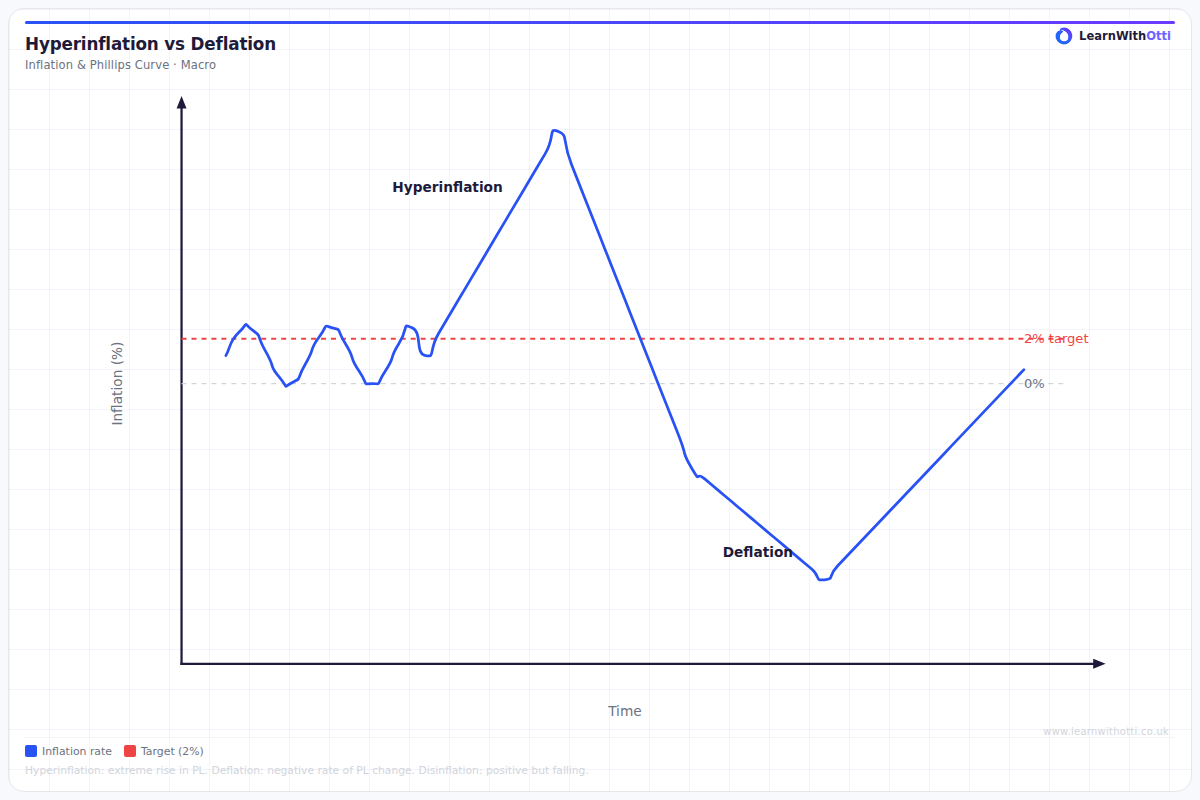
Diagram showing the self-reinforcing cycles of rising inflation (wage-price spiral) or deflation (debt-deflation trap) and their macroeconomic implications.
Printable preview
Download a static PNG of this diagram to print or include in revision notes.
Download PNGWhat this diagram shows
The inflation-deflation spiral diagram illustrates how an economy can get trapped in a self-reinforcing cycle of falling prices, reduced spending, and economic decline. It shows how initial deflation leads to consumers delaying purchases (expecting lower prices tomorrow), which reduces demand, forces businesses to cut prices further, and creates unemployment. This creates a vicious cycle where each stage reinforces the others, making it extremely difficult for the economy to recover without significant government intervention.
Key points
- Deflation creates expectations of further price falls, encouraging consumers to delay spending
- Reduced consumer spending leads to falling aggregate demand and business revenues
- Businesses respond by cutting production, employment, and prices to try to stimulate demand
- Rising unemployment reduces disposable income, further decreasing consumer spending
- The cycle becomes self-perpetuating as deflationary expectations become entrenched in the economy
Exam tip
Examiners are impressed when students explain the self-reinforcing nature of the spiral and use specific terminology like 'deflationary expectations' and 'liquidity trap'. The key is showing you understand this isn't just falling prices, but a vicious cycle where each stage makes the next stage worse.
Common mistakes
Students often confuse this with simple price deflation and fail to explain the cyclical, self-reinforcing nature of the process. They forget to mention how expectations drive consumer behaviour, which is crucial to understanding why the spiral continues.
Exam board notes
All major exam boards treat this diagram identically, though OCR tends to link it more explicitly to liquidity traps and monetary policy limitations. AQA often combines it with Phillips Curve analysis in longer essay questions.
Related diagrams
Ask Otti about this diagram
Our AI tutor can walk you through every curve, explain exam technique, and quiz you on it.