Demand-Pull Inflation
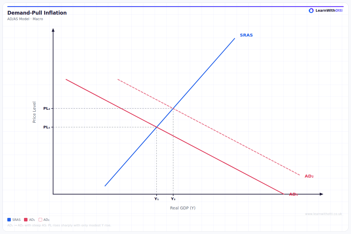
AD/AS diagram showing demand-pull inflation where excess aggregate demand pulls the price level upward, typically associated with a positive output gap.
Printable preview
Download a static PNG of this diagram to print or include in revision notes.
Download PNGWhat this diagram shows
The demand-pull inflation diagram shows how rising aggregate demand in an economy leads to higher price levels when the economy is near or at full capacity. When AD shifts rightward (from AD1 to AD2), it creates excess demand at the original price level, forcing prices to rise from P1 to P2. This type of inflation occurs when 'too much money chases too few goods' - the economy's productive capacity cannot keep up with the increased spending power in the economy. It's particularly relevant when unemployment is low and the economy is operating close to full employment.
Key points
- Demand-pull inflation is caused by increases in any component of aggregate demand (C+I+G+X-M)
- The AS curve becomes increasingly inelastic as the economy approaches full employment, making price rises more likely
- Common causes include: low interest rates, increased government spending, rising consumer confidence, or expansionary monetary policy
- The steeper the AS curve, the greater the inflationary impact of any increase in AD
- Real GDP may increase initially, but the main effect is higher prices rather than higher output when the economy is near capacity
Exam tip
Always clearly label the shift as an increase in aggregate demand (AD shifting right) and explain the causation - that excess demand at the original price level forces prices up. Examiners are impressed when students link the diagram to real-world examples like government stimulus spending or low interest rates driving consumer demand.
Common mistakes
Students often draw AD shifting left instead of right, or fail to explain why prices rise (they don't mention the excess demand created at the original price level). Many also forget to explain that this type of inflation is most problematic when the economy is already operating near full capacity.
Exam board notes
All major exam boards treat this diagram identically, though OCR places slightly more emphasis on linking demand-pull inflation to the Phillips Curve relationship. CIE often requires students to distinguish between demand-pull and cost-push inflation in the same question.
Related diagrams
Ask Otti about this diagram
Our AI tutor can walk you through every curve, explain exam technique, and quiz you on it.