Positive Output Gap (Inflationary Gap)
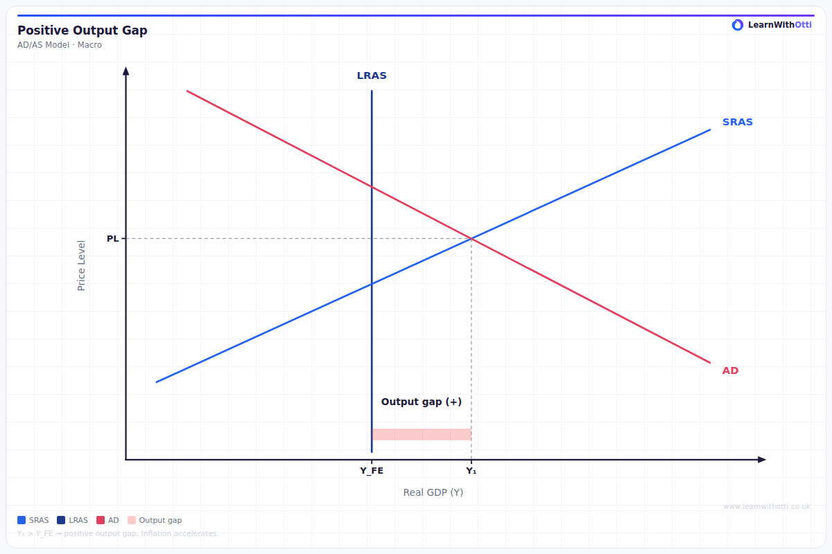
AD/AS diagram illustrating a positive output gap where actual GDP exceeds potential GDP, associated with demand-pull inflation and overheating.
Printable preview
Download a static PNG of this diagram to print or include in revision notes.
Download PNGWhat this diagram shows
A positive output gap (inflationary gap) occurs when actual GDP exceeds potential GDP, meaning the economy is producing beyond its sustainable capacity. This diagram shows aggregate demand intersecting short-run aggregate supply at a point above the long-run aggregate supply curve. The gap between actual and potential output creates upward pressure on prices as resources become scarce and firms compete for limited factors of production, leading to demand-pull inflation.
Key points
- Actual GDP (Y1) is greater than potential GDP (Yf), creating excess demand in the economy
- The economy operates beyond full employment, causing wage inflation and rising production costs
- Demand-pull inflation occurs as aggregate demand exceeds the economy's productive capacity
- The gap is unsustainable in the long run - rising prices will eventually shift SRAS leftward until equilibrium returns to potential GDP
- Government may use contractionary fiscal or monetary policy to reduce aggregate demand and close the gap
Exam tip
Students often confuse the direction of causation - emphasize that the positive output gap CAUSES inflationary pressure, not the other way around. Examiners love to see you explain that this represents unsustainable economic growth that will eventually self-correct through rising prices reducing real aggregate demand.
Common mistakes
Students frequently label the axes incorrectly or place the equilibrium point at the intersection of AD and LRAS rather than AD and SRAS. Many also forget to show that the inflationary gap is the horizontal distance between actual and potential GDP, not a vertical price difference.
Exam board notes
All major exam boards treat this diagram identically. However, OCR places slightly more emphasis on the policy responses to close inflationary gaps, while AQA tends to focus more on the automatic adjustment mechanism through rising prices.
Related diagrams
Ask Otti about this diagram
Our AI tutor can walk you through every curve, explain exam technique, and quiz you on it.