Negative Output Gap (Recessionary Gap)
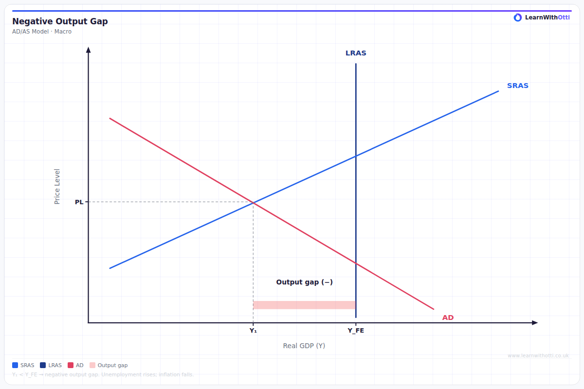
AD/AS diagram illustrating a negative output gap where actual GDP is below potential GDP, associated with demand-deficient unemployment and deflationary pressure.
Printable preview
Download a static PNG of this diagram to print or include in revision notes.
Download PNGWhat this diagram shows
A negative output gap occurs when actual real GDP falls below potential real GDP, indicating the economy is underperforming and resources are underutilized. This diagram shows equilibrium occurring to the left of the full employment level, creating unemployment and spare capacity in the economy. The gap represents lost output that could have been produced if all resources were fully employed. This concept is crucial for understanding economic cycles, unemployment causes, and the justification for government intervention during recessions.
Key points
- Actual GDP (Y1) is less than potential GDP (Yfe), creating a negative output gap
- The economy operates with spare capacity, high unemployment, and underutilized resources
- Deflationary pressure exists as actual price level is below what it would be at full employment
- The gap may self-correct through falling wages and prices, shifting SRAS rightward over time
- Government intervention through expansionary fiscal or monetary policy can close the gap faster
Exam tip
Students often confuse the negative output gap with a simple fall in AD - make sure you clearly explain that the gap measures the difference between actual and potential output, not just current performance. Examiners are impressed when you link the diagram to real-world examples like the 2008 financial crisis and explain the automatic adjustment mechanisms.
Common mistakes
Students frequently label the axes incorrectly or fail to clearly mark both the actual equilibrium point and the potential output level. Many also forget to explain that this represents a waste of economic resources, not just lower growth.
Exam board notes
All major exam boards treat this diagram identically, though OCR places slightly more emphasis on the self-correcting mechanisms through wage-price flexibility. Some boards may use slightly different terminology (output gap vs GDP gap) but the concept remains the same.
Related diagrams
Ask Otti about this diagram
Our AI tutor can walk you through every curve, explain exam technique, and quiz you on it.