Demand-Deficient (Cyclical) Unemployment
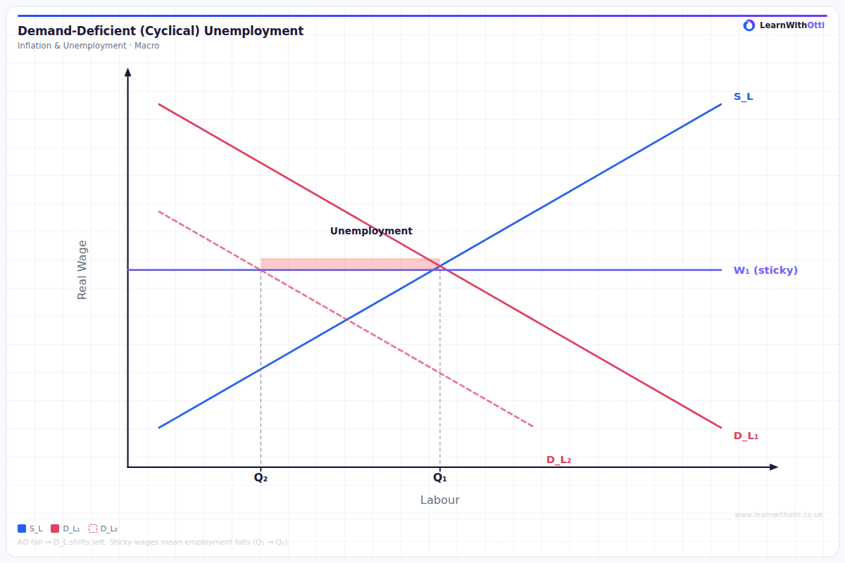
Labour market diagram showing demand-deficient unemployment caused by a fall in aggregate demand, illustrated as a leftward shift in the labour demand curve.
Printable preview
Download a static PNG of this diagram to print or include in revision notes.
Download PNGWhat this diagram shows
This diagram shows how demand-deficient unemployment occurs when aggregate demand (AD) falls below the level needed for full employment equilibrium. When AD shifts left from AD1 to AD2, real GDP falls from Y1 to Y2, creating a negative output gap. This reduction in economic activity means firms need fewer workers, leading to cyclical unemployment that rises and falls with the business cycle. It's called 'demand-deficient' because insufficient aggregate demand is the root cause of the unemployment.
Key points
- Demand-deficient unemployment occurs when AD falls below full employment level, creating a negative output gap
- It's cyclical because it follows the pattern of economic booms and recessions in the business cycle
- Unlike structural unemployment, it's temporary and will reduce when economic growth returns
- The unemployment gap represents workers who lose jobs due to reduced economic activity, not skills mismatches
- Keynesian economists argue this justifies government intervention to boost AD through fiscal or monetary policy
Exam tip
Students often confuse demand-deficient unemployment with structural unemployment - remember that cyclical unemployment is temporary and directly linked to the economic cycle. Examiners are impressed when you clearly explain how this unemployment will naturally fall when aggregate demand recovers, unlike structural unemployment which requires active intervention.
Common mistakes
Students frequently mix up demand-deficient unemployment with structural unemployment, failing to emphasize that cyclical unemployment is temporary and economy-wide. They also sometimes forget to explain that this type of unemployment will naturally decrease when aggregate demand recovers during economic expansion.
Exam board notes
All major exam boards treat this diagram identically, though OCR places slightly more emphasis on linking it to Keynesian vs Classical debates about government intervention. AQA and Edexcel often combine this with Phillips Curve analysis in longer essay questions.
Related diagrams
Ask Otti about this diagram
Our AI tutor can walk you through every curve, explain exam technique, and quiz you on it.