Types of Unemployment and Aggregate Supply
Diagram illustrating different types of unemployment (frictional, structural, demand-deficient, seasonal) and their relationship to the NAIRU and LRAS position.
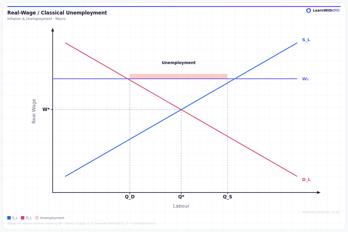
Printable preview
Download a static PNG of this diagram to print or include in revision notes.
Download PNGWhat this diagram shows
This diagram illustrates how different types of unemployment relate to the aggregate supply curve and shows the trade-off between inflation and unemployment. The vertical section of the AS curve represents full employment where only structural and frictional unemployment remain, while the upward-sloping section shows how reducing cyclical unemployment through increased aggregate demand leads to higher price levels. Understanding this relationship is crucial for analyzing government policy effectiveness and the constraints faced when trying to reduce unemployment.
Key points
- Structural unemployment occurs due to skills mismatches and technological change, existing even at full employment
- Cyclical unemployment results from insufficient aggregate demand during recessions and can be reduced by demand-side policies
- Frictional unemployment is temporary and occurs as workers move between jobs - it's considered natural in a dynamic economy
- The vertical section of AS shows the natural rate of unemployment where only structural and frictional unemployment exist
- Moving up the AS curve reduces cyclical unemployment but increases inflation, demonstrating the short-run Phillips Curve trade-off
Exam tip
Examiners are impressed when students clearly distinguish between different types of unemployment and link them to specific sections of the aggregate supply curve. The key insight that impresses is understanding that structural unemployment affects the vertical section of AS, while cyclical unemployment relates to movement along the curve during economic fluctuations.
Common mistakes
Students often confuse structural unemployment with cyclical unemployment, incorrectly thinking demand-side policies can solve skills mismatches. They also mistakenly believe that zero unemployment is achievable, failing to understand that frictional and structural unemployment always exist in a healthy economy.
Exam board notes
All major exam boards treat this diagram identically, though OCR places slightly more emphasis on the policy implications of different unemployment types. CIE occasionally asks for more detailed explanations of how technological change creates structural unemployment.
Related diagrams
Ask Otti about this diagram
Our AI tutor can walk you through every curve, explain exam technique, and quiz you on it.