LRAS Shift Right (Long-Run Economic Growth)
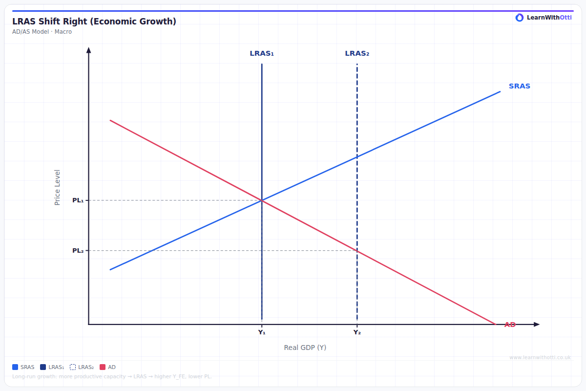
AD/AS diagram showing a rightward shift of the LRAS representing an increase in the productive capacity of the economy (long-run supply-side growth).
Printable preview
Download a static PNG of this diagram to print or include in revision notes.
Download PNGWhat this diagram shows
This diagram shows long-run economic growth, represented by a rightward shift of the Long-Run Aggregate Supply (LRAS) curve from LRAS₁ to LRAS₂. This shift indicates an increase in the economy's productive capacity - the maximum output the economy can produce when all resources are fully employed. The shift results in a higher equilibrium level of real GDP (from Y₁ to Y₂) and can lead to lower price levels, demonstrating sustainable, non-inflationary growth that improves living standards.
Key points
- Rightward LRAS shift represents an increase in the economy's productive capacity and potential output
- Caused by supply-side improvements: better technology, increased productivity, more skilled labour, or greater capital stock
- Results in sustainable economic growth with potential for lower inflation (price level falls from P₁ to P₂)
- Creates a new long-run equilibrium at higher real GDP with improved economic welfare
- Takes time to achieve as it requires structural changes to the economy's productive capacity
Exam tip
Always distinguish between short-run economic growth (movement along LRAS or rightward shift of SRAS) and long-run economic growth (rightward shift of LRAS). Examiners are impressed when students clearly link LRAS shifts to specific supply-side policies and explain the time lag involved in achieving long-run growth.
Common mistakes
Students often confuse this with short-run growth, incorrectly showing AD shifting right instead of LRAS. They also frequently forget that LRAS shifts represent changes in productive capacity, not just temporary increases in output.
Exam board notes
All major exam boards treat this diagram identically, though OCR places slightly more emphasis on linking LRAS shifts to specific supply-side policies in their mark schemes. CIE sometimes asks students to distinguish between actual and potential GDP growth in relation to this diagram.
Related diagrams
Ask Otti about this diagram
Our AI tutor can walk you through every curve, explain exam technique, and quiz you on it.