PPF and Economic Growth
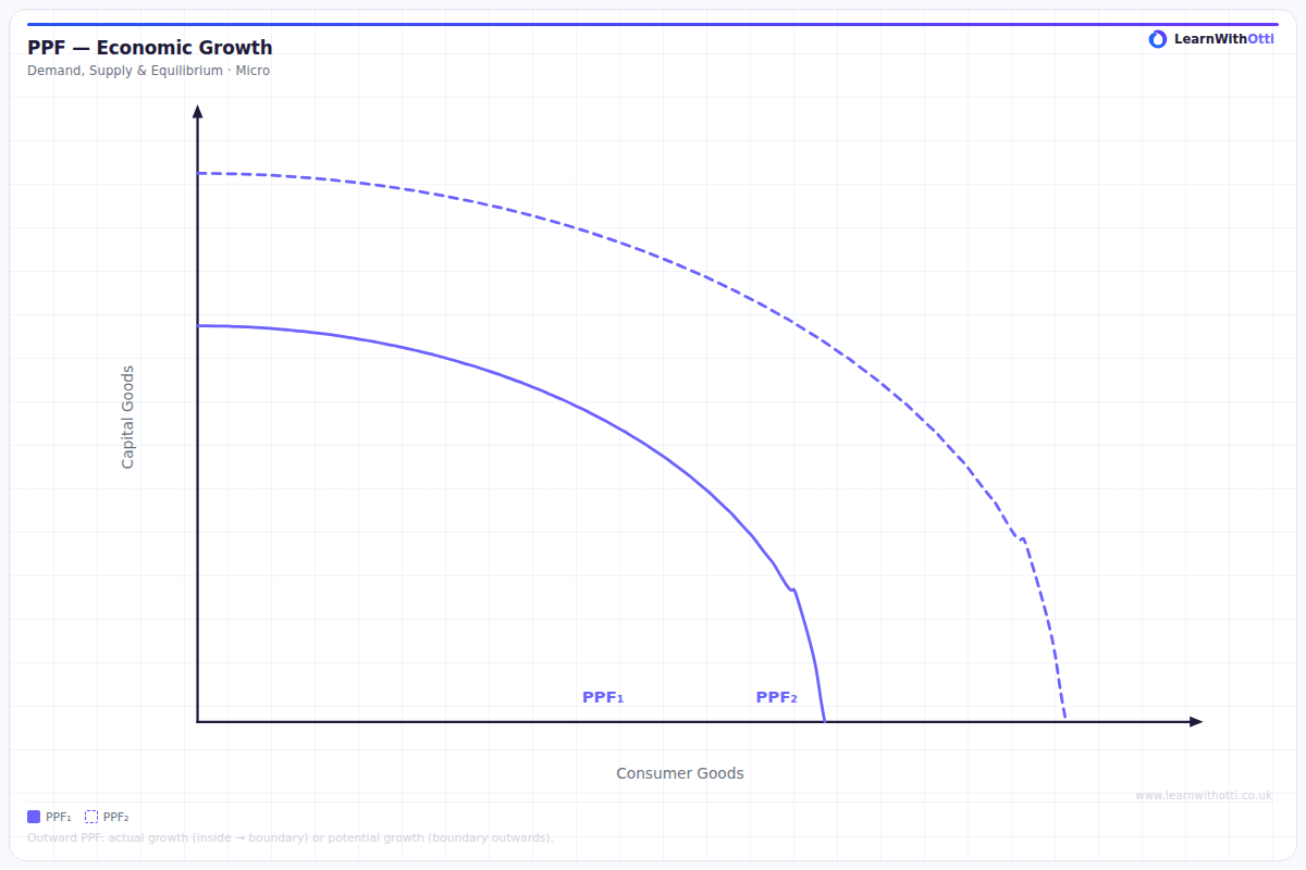
PPF diagram showing an outward shift representing economic growth (increase in productive capacity) through capital accumulation, technology, or labour force expansion.
Printable preview
Download a static PNG of this diagram to print or include in revision notes.
Download PNGWhat this diagram shows
The PPF and Economic Growth diagram shows how an economy's production possibilities frontier shifts outward over time as economic growth occurs. The original PPF represents the maximum combinations of two goods (often consumer goods and capital goods) that can be produced with current resources and technology. When economic growth happens through increased resources, better technology, or improved productivity, the entire PPF shifts outward, allowing the economy to produce more of both goods than previously possible.
Key points
- Economic growth is shown by an outward shift of the entire PPF curve, not movement along it
- Growth can be caused by increased quantity/quality of factors of production (land, labour, capital) or technological advances
- The shape of the new PPF may change - it could shift more for one good than another if growth is concentrated in specific sectors
- Investment in capital goods (choosing points toward the capital goods axis) enables greater future economic growth
- The opportunity cost concept still applies - resources used for growth could have been used for current consumption
Exam tip
Always distinguish between movements ALONG the PPF (showing different combinations of output with existing resources) versus SHIFTS of the PPF (showing economic growth from increased resources or productivity). Examiners are impressed when students correctly identify that economic growth requires the curve to shift outward, not just movement to a different point on the same curve.
Common mistakes
Students often confuse economic growth (PPF shifting outward) with economic recovery (moving from inside the PPF back to the frontier). They also frequently forget that the PPF shift represents potential growth - the economy must actually utilize the new capacity to achieve real growth.
Exam board notes
All major exam boards treat this diagram identically, though OCR tends to ask more application questions about specific factors causing PPF shifts. CIE occasionally includes numerical data requiring students to plot new PPF coordinates after growth.
Related diagrams
Ask Otti about this diagram
Our AI tutor can walk you through every curve, explain exam technique, and quiz you on it.