Production Possibility Frontier (PPF)
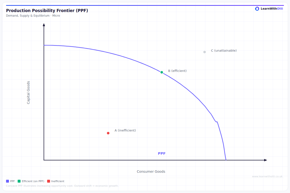
Concave PPF showing the maximum combinations of two goods an economy can produce with given resources, illustrating opportunity cost, productive efficiency, and scarcity.
Printable preview
Download a static PNG of this diagram to print or include in revision notes.
Download PNGWhat this diagram shows
The Production Possibility Frontier shows the maximum possible combinations of two goods or services that an economy can produce when all resources are fully and efficiently employed. The curve represents the trade-off between producing different goods - to produce more of one good, you must sacrifice some production of another. Any point on the curve shows productive efficiency, while points inside represent inefficiency and points outside are currently unattainable. This diagram is fundamental to understanding economic growth, as outward shifts of the PPF demonstrate an economy's increased productive capacity over time.
Key points
- Points ON the curve = productive efficiency (maximum output with given resources)
- Points INSIDE the curve = inefficiency/unemployment of resources
- Points OUTSIDE the curve = currently impossible with existing resources and technology
- The curve is typically bowed outward due to increasing opportunity costs
- Outward shifts represent economic growth through increased resources or improved technology
Exam tip
Examiners are impressed when students correctly identify that points inside the PPF represent inefficiency (unemployed resources), not just lower production levels. Always explain why the PPF is curved - it's due to the law of diminishing returns and resources not being perfectly transferable between different types of production.
Common mistakes
Students often confuse points inside the PPF as representing 'less developed economies' rather than inefficient use of resources within any economy. They also frequently forget that movement along the curve shows opportunity cost, while shifts of the entire curve represent changes in productive capacity.
Exam board notes
All major exam boards treat this diagram identically in terms of core concepts. However, CIE tends to place slightly more emphasis on linking PPF shifts to their causes (population growth, capital investment, technological progress) in longer essay questions.
Related diagrams
Ask Otti about this diagram
Our AI tutor can walk you through every curve, explain exam technique, and quiz you on it.