AD/AS Diagram — Keynesian Model
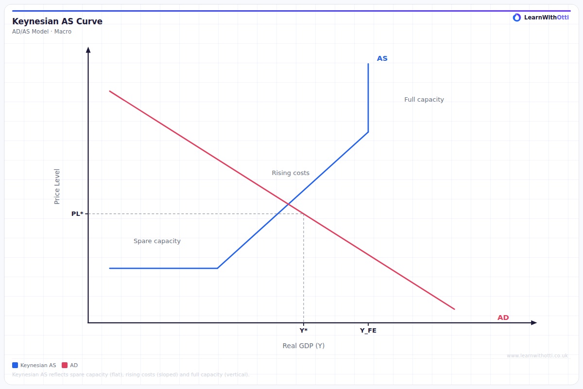
Keynesian AD/AS diagram with a flat SRAS and an L-shaped (or horizontal) LRAS in the short run, illustrating how demand stimulus can raise real output when there is spare capacity.
Printable preview
Download a static PNG of this diagram to print or include in revision notes.
Download PNGWhat this diagram shows
The Keynesian AD/AS model shows how aggregate demand and aggregate supply interact in the economy, but with a distinctively shaped AS curve that reflects Keynesian economic theory. The AS curve is horizontal at low output levels (indicating spare capacity and unemployment), then becomes upward sloping, and finally vertical at full employment. This shape demonstrates Keynes's view that economies can remain stuck at less than full employment for extended periods, and that demand-side policies can increase output without causing inflation when there's spare capacity.
Key points
- The Keynesian AS curve has three distinct sections: horizontal (spare capacity), upward sloping (approaching full capacity), and vertical (full employment)
- In the horizontal section, increases in aggregate demand lead to higher real GDP with no change in the price level
- In the upward sloping section, increases in AD cause both higher output and some inflation as resources become scarcer
- In the vertical section, any increase in AD only causes inflation as the economy cannot produce more output
- This model supports Keynesian policy recommendations for demand management, especially during recessions when spare capacity exists
Exam tip
Students often confuse the Keynesian AS curve with the classical version - make sure you can clearly explain why the Keynesian AS curve is horizontal at low output levels and becomes increasingly steep. Examiners are impressed when you link the shape of the curve to Keynes's assumptions about unemployment and spare capacity in the economy.
Common mistakes
Students frequently draw the AS curve as a smooth curve rather than showing the distinct horizontal, upward sloping, and vertical sections that are crucial to Keynesian theory. They also often fail to explain why demand increases don't cause inflation in the horizontal section.
Exam board notes
All major exam boards include the Keynesian AS curve, though AQA and Edexcel tend to emphasize the policy implications more heavily in their mark schemes. OCR often requires more detailed explanation of why the curve has its distinctive shape, while CIE frequently tests the differences between Keynesian and classical AS curves in comparative questions.
Related diagrams
Ask Otti about this diagram
Our AI tutor can walk you through every curve, explain exam technique, and quiz you on it.