Keynesian Cross (45° Diagram)
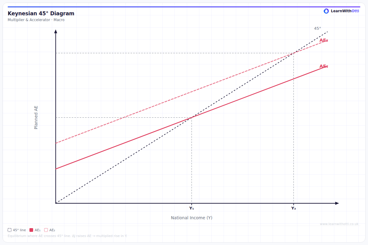
The Keynesian cross (45° line) diagram showing equilibrium national income where aggregate expenditure equals national income, and the impact of injections on equilibrium.
Printable preview
Download a static PNG of this diagram to print or include in revision notes.
Download PNGWhat this diagram shows
The Keynesian Cross diagram shows how equilibrium national income is determined in the short run when aggregate expenditure (AE) equals total output/income (Y). The 45° line represents all points where spending equals income, while the AE curve shows planned spending at different income levels. Where these lines intersect determines the equilibrium level of national income, which may not necessarily be at full employment - a key Keynesian insight that justifies government intervention through fiscal policy.
Key points
- The 45° line shows Y=AE (income equals aggregate expenditure) - every point on this line represents potential equilibrium
- The AE curve is upward sloping due to the marginal propensity to consume - as income rises, consumption rises but by less than the income increase
- Equilibrium occurs where AE intersects the 45° line - this is where planned spending equals actual output
- If AE is above the 45° line, there's excess demand leading to stock depletion and increased production
- Fiscal policy shifts the AE curve: increased government spending or lower taxes shift AE upward, while spending cuts or tax rises shift it downward
Exam tip
Always clearly label the 45° line as Y=AE (where income equals aggregate expenditure) and show equilibrium occurs where AE intersects this line, not where AE intersects the x-axis. Examiners are impressed when students explain that shifts in AE lead to multiplied changes in equilibrium income, demonstrating understanding of the multiplier effect.
Common mistakes
Students often confuse the equilibrium point as being where AE meets the x-axis rather than where AE intersects the 45° line. Many also forget to explain that equilibrium income can occur below full employment, missing the key Keynesian argument for government intervention.
Exam board notes
All major exam boards treat this diagram identically, though OCR tends to emphasize the mathematical relationships more explicitly. CIE occasionally asks for numerical calculations using this framework in their data response questions.
Related diagrams
Ask Otti about this diagram
Our AI tutor can walk you through every curve, explain exam technique, and quiz you on it.