AD Shift Right — Keynesian (Below Full Employment)
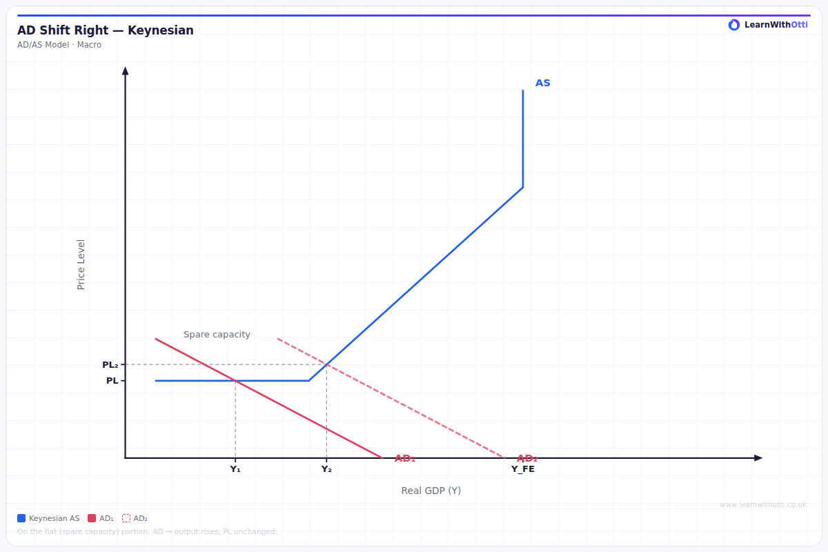
Keynesian AD/AS diagram showing a rightward AD shift below full employment, increasing real GDP with little or no rise in the price level.
Printable preview
Download a static PNG of this diagram to print or include in revision notes.
Download PNGWhat this diagram shows
This diagram shows what happens when aggregate demand increases in the Keynesian model when the economy is operating below full employment. The horizontal section of the Keynesian AS curve means that when AD shifts right, real GDP increases significantly while the price level remains constant. This demonstrates Keynes' key argument that during recessions, governments can stimulate demand to reduce unemployment without causing inflation. It's crucial for understanding why Keynesian economists support demand-side policies during economic downturns.
Key points
- The AS curve is horizontal below full employment, showing spare capacity in the economy
- Rightward AD shift increases real GDP from Y1 to Y2 with no change in price level
- This demonstrates that unemployment can be reduced without causing inflation
- The increase in output occurs because idle resources (unemployed workers, unused factories) are brought back into production
- This justifies Keynesian demand-side policies like increased government spending or lower interest rates during recessions
Exam tip
Examiners look for students who clearly explain that in the Keynesian model below full employment, the AS curve is horizontal, meaning prices don't rise when AD increases. Students often forget to mention that this shows unemployment can be reduced without inflation, which is the key Keynesian insight that impresses examiners.
Common mistakes
Students often draw the price level rising when AD shifts right, forgetting that the Keynesian AS curve is horizontal below full employment. They also frequently fail to explain why the AS curve is horizontal - because there are unemployed resources that can be utilized without bidding up wages and prices.
Exam board notes
All major exam boards treat this diagram identically, emphasizing the horizontal nature of the Keynesian AS curve below full employment. Some boards like AQA may place slightly more emphasis on linking this to historical context of the 1930s Depression and Keynes' policy recommendations.
Related diagrams
Ask Otti about this diagram
Our AI tutor can walk you through every curve, explain exam technique, and quiz you on it.