Currency Appreciation
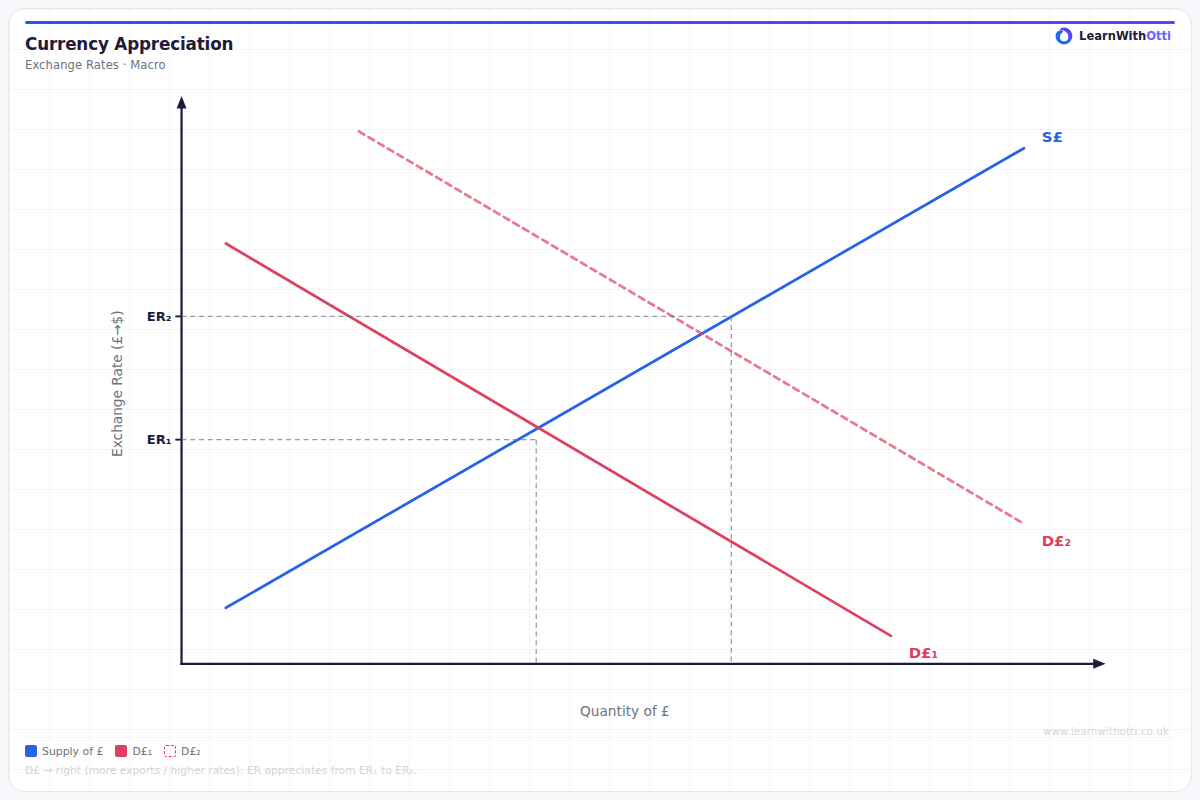
Foreign exchange diagram showing an increase in demand for currency (or decrease in supply) leading to currency appreciation and its effects on exports, imports, and the current account.
Printable preview
Download a static PNG of this diagram to print or include in revision notes.
Download PNGWhat this diagram shows
A currency appreciation diagram shows an increase in the value of one currency relative to another, represented by an upward shift in the exchange rate. This occurs when demand for the currency increases or supply decreases, often due to factors like higher interest rates, improved economic performance, or increased foreign investment. The diagram typically uses supply and demand curves to show how the equilibrium exchange rate moves to a higher level. Understanding this is crucial for analysing international trade impacts, monetary policy effects, and economic competitiveness.
Key points
- Currency appreciation means the currency becomes stronger - you can buy more foreign currency with each unit of domestic currency
- Caused by increased demand (higher interest rates, economic growth, political stability) or decreased supply of the currency
- Makes exports more expensive for foreign buyers, potentially reducing export competitiveness
- Makes imports cheaper for domestic consumers, helping to reduce imported inflation
- Can improve living standards through cheaper foreign goods but may harm export industries and employment
Exam tip
When analysing currency appreciation, always explain both the cause AND the effects on different stakeholders. Examiners are impressed when students can link the appreciation to specific economic indicators like current account balance, inflation rates, and employment in export industries.
Common mistakes
Students often confuse appreciation with depreciation, mixing up which direction the currency is moving on the diagram. They also frequently forget that appreciation has mixed effects - it's not simply 'good' or 'bad' for the economy.
Exam board notes
All major exam boards treat this diagram identically. However, Edexcel and AQA tend to focus more heavily on the effects on trade balances, while OCR often emphasises the impact on different stakeholders in their mark schemes.
Related diagrams
Ask Otti about this diagram
Our AI tutor can walk you through every curve, explain exam technique, and quiz you on it.