Currency Depreciation
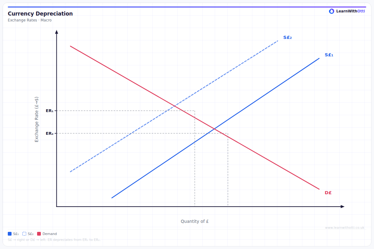
Foreign exchange diagram showing a fall in demand for currency (or increase in supply) leading to depreciation, improving competitiveness but risking import-cost inflation.
Printable preview
Download a static PNG of this diagram to print or include in revision notes.
Download PNGWhat this diagram shows
A currency depreciation diagram shows how a currency loses value against other currencies in the foreign exchange market. The diagram typically displays supply and demand curves for a currency, with depreciation shown as either decreased demand (leftward shift) or increased supply (rightward shift), causing the exchange rate to fall. This is crucial for A-Level as it helps explain how international trade, capital flows, and monetary policy interact to influence a country's currency value and economic competitiveness.
Key points
- Depreciation is shown by a fall in the exchange rate (price of the currency) on the vertical axis
- Can be caused by decreased demand (curve shifts left) due to factors like lower interest rates or reduced foreign investment
- Can also result from increased supply (curve shifts right) when domestic investors buy more foreign assets
- Makes exports cheaper and imports more expensive, improving the current account but potentially causing inflation
- Occurs automatically in floating exchange rate systems through market forces
Exam tip
Students often confuse depreciation with devaluation - remember depreciation occurs in floating exchange rate systems through market forces, while devaluation is a deliberate government action in fixed systems. Examiners are impressed when you clearly link the downward shift in demand/supply curves to specific economic causes like falling interest rates or current account deficits.
Common mistakes
Students frequently draw the curves shifting in the wrong direction when explaining the cause of depreciation. Many also forget to clearly label which currency they're analyzing - always specify whether you're showing the market for pounds, dollars, euros etc.
Exam board notes
All major exam boards treat this diagram identically, focusing on the standard supply and demand framework. However, CIE and OCR tend to place slightly more emphasis on linking currency depreciation to developing country contexts and commodity price fluctuations in their mark schemes.
Related diagrams
Ask Otti about this diagram
Our AI tutor can walk you through every curve, explain exam technique, and quiz you on it.