Fixed Exchange Rate and Intervention Band
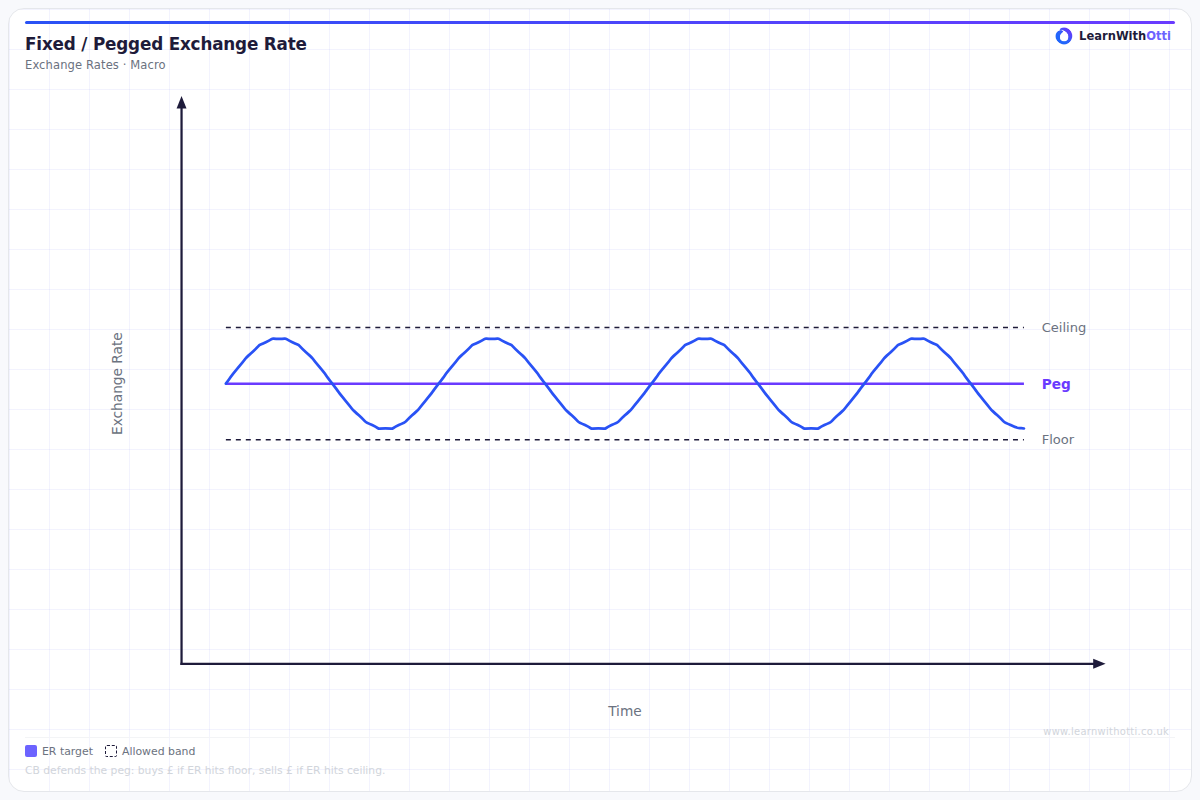
Diagram showing a fixed exchange rate regime with a managed band, illustrating how the central bank intervenes to maintain the rate within the target range.
Printable preview
Download a static PNG of this diagram to print or include in revision notes.
Download PNGWhat this diagram shows
This diagram shows how a central bank maintains a fixed exchange rate within an acceptable range (intervention band) rather than at one precise value. The horizontal lines represent the upper and lower limits of this band, and the central bank only intervenes when the exchange rate hits these boundaries. When the rate reaches the upper limit, the bank sells domestic currency to weaken it; when it hits the lower limit, the bank buys domestic currency to strengthen it. This system provides more flexibility than a rigid fixed rate while still maintaining exchange rate stability.
Key points
- The intervention band consists of upper and lower limits around a central fixed rate target
- Central bank intervention only occurs when the exchange rate touches the band boundaries, not within the range
- At the upper limit, the central bank sells domestic currency and buys foreign currency to prevent further appreciation
- At the lower limit, the central bank buys domestic currency and sells foreign reserves to prevent further depreciation
- This system allows for some natural fluctuation while maintaining overall exchange rate stability
Exam tip
Examiners love to see students explain WHY central banks use intervention bands rather than defending a single fixed rate. Many students forget that intervention only occurs at the band limits - not throughout the entire range - so make this distinction crystal clear in your answers.
Common mistakes
Students often incorrectly state that central banks intervene continuously throughout the entire band range. The key point is that intervention only happens at the specific upper and lower boundaries of the band.
Exam board notes
All major exam boards treat this diagram identically, focusing on the mechanics of intervention at band limits and the rationale for using bands rather than rigid fixed rates.
Related diagrams
Ask Otti about this diagram
Our AI tutor can walk you through every curve, explain exam technique, and quiz you on it.